Northern Lights 2025 UPC Catalog
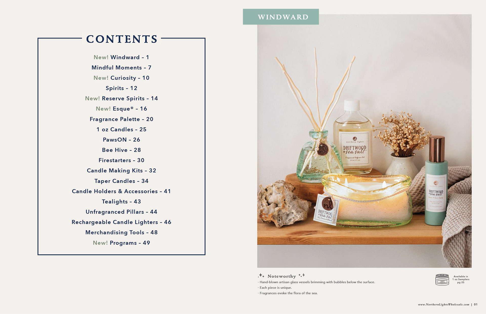
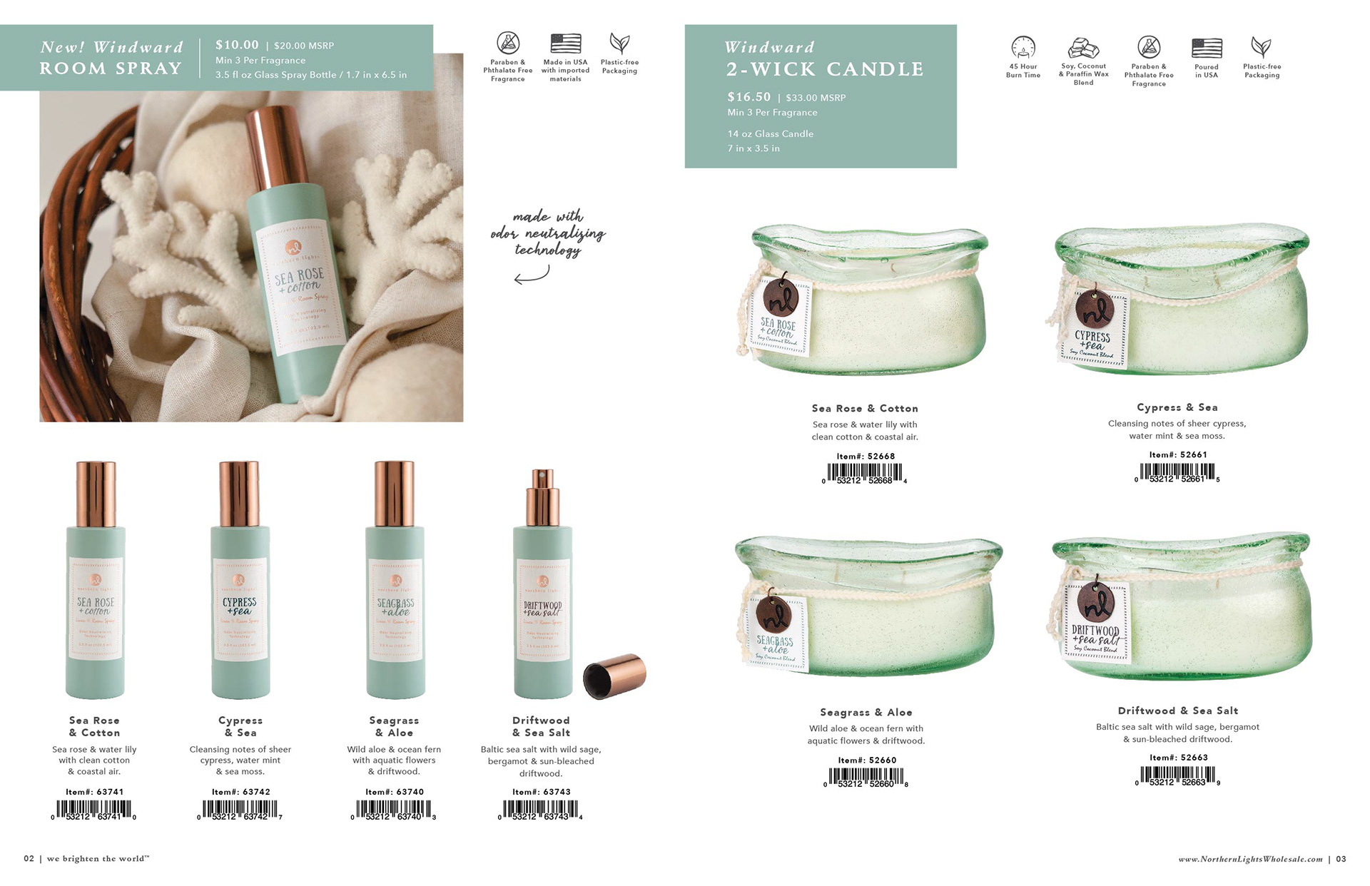
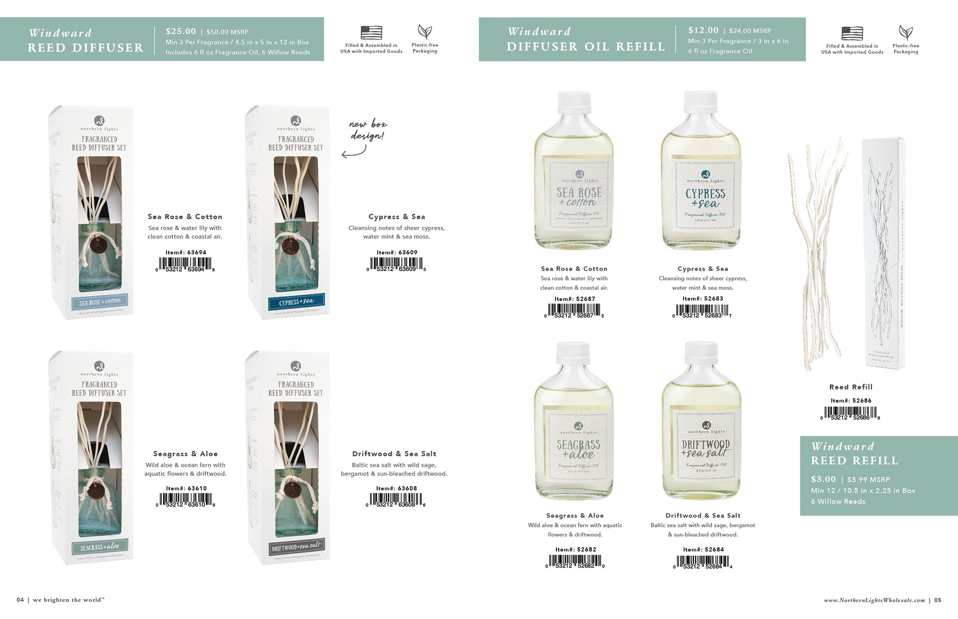
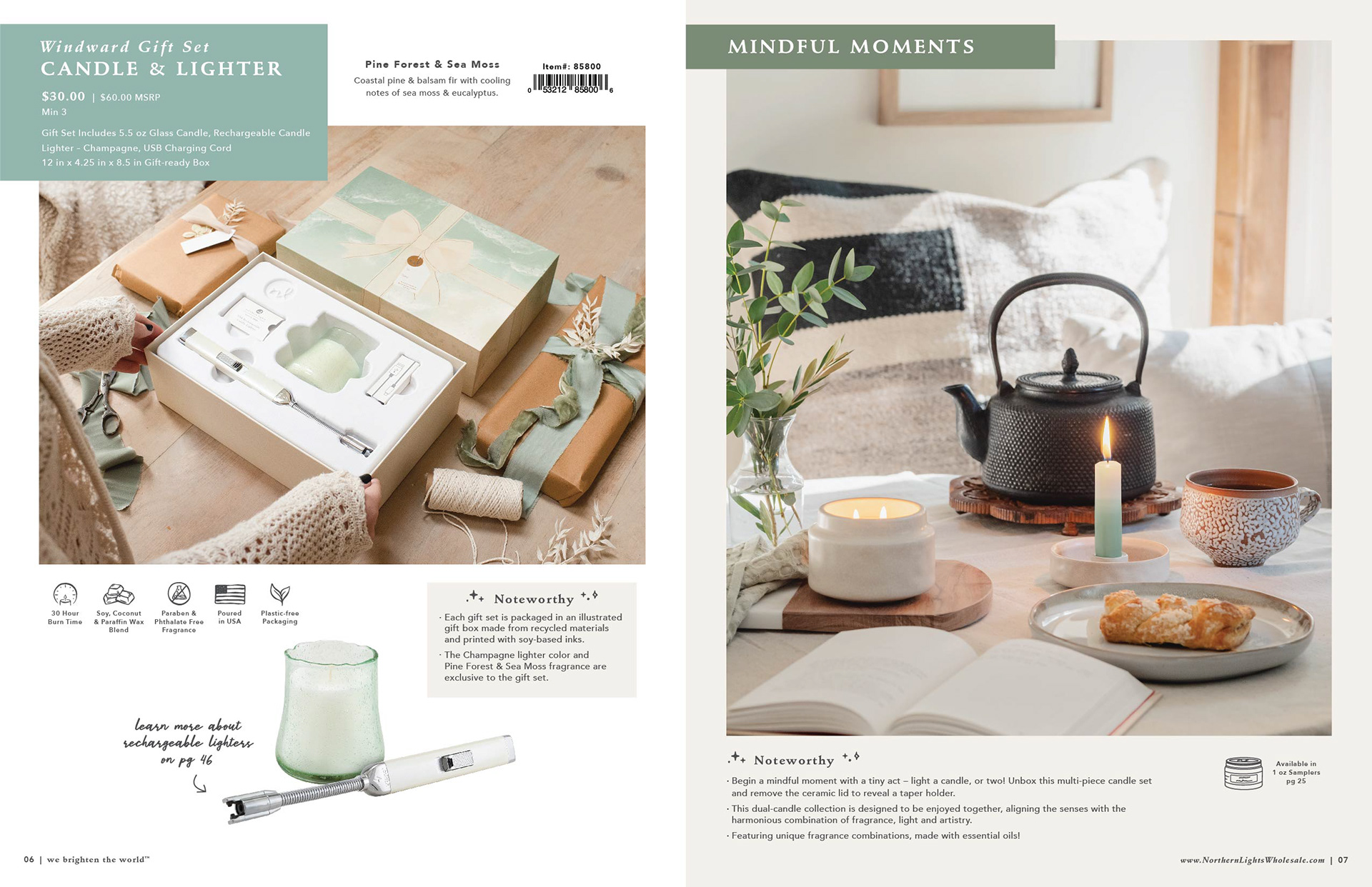
I was responsible for putting this catalog together, as well as attending the photo shoot, partial photography at the photo shoot, editing the all final photos for the catalog, and formatting the catalog for all company uses. 3,700 printed copies were ordered!
This catalog is a great example of my skills related to photography, photo editing and compositing, and typography.



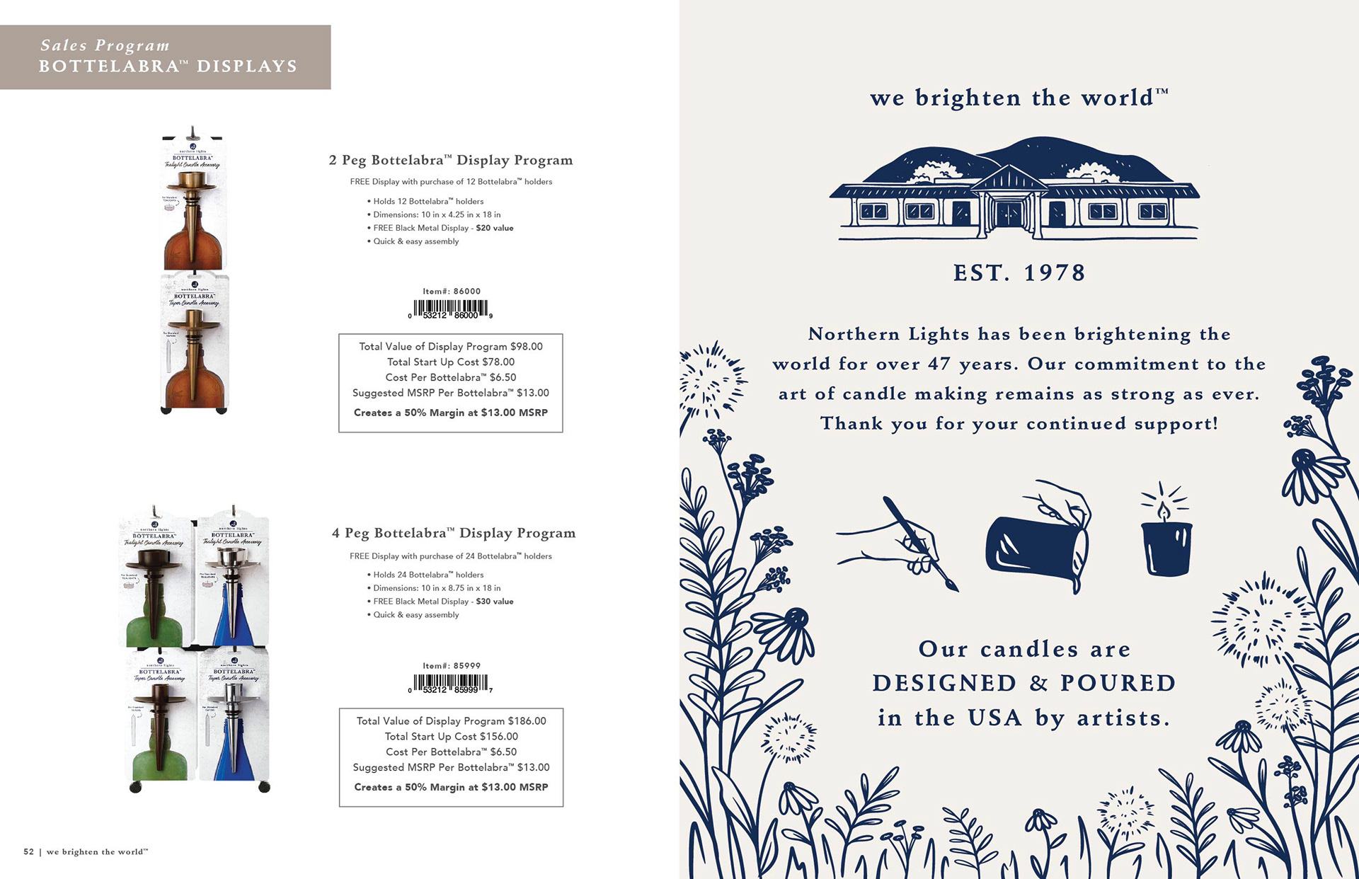
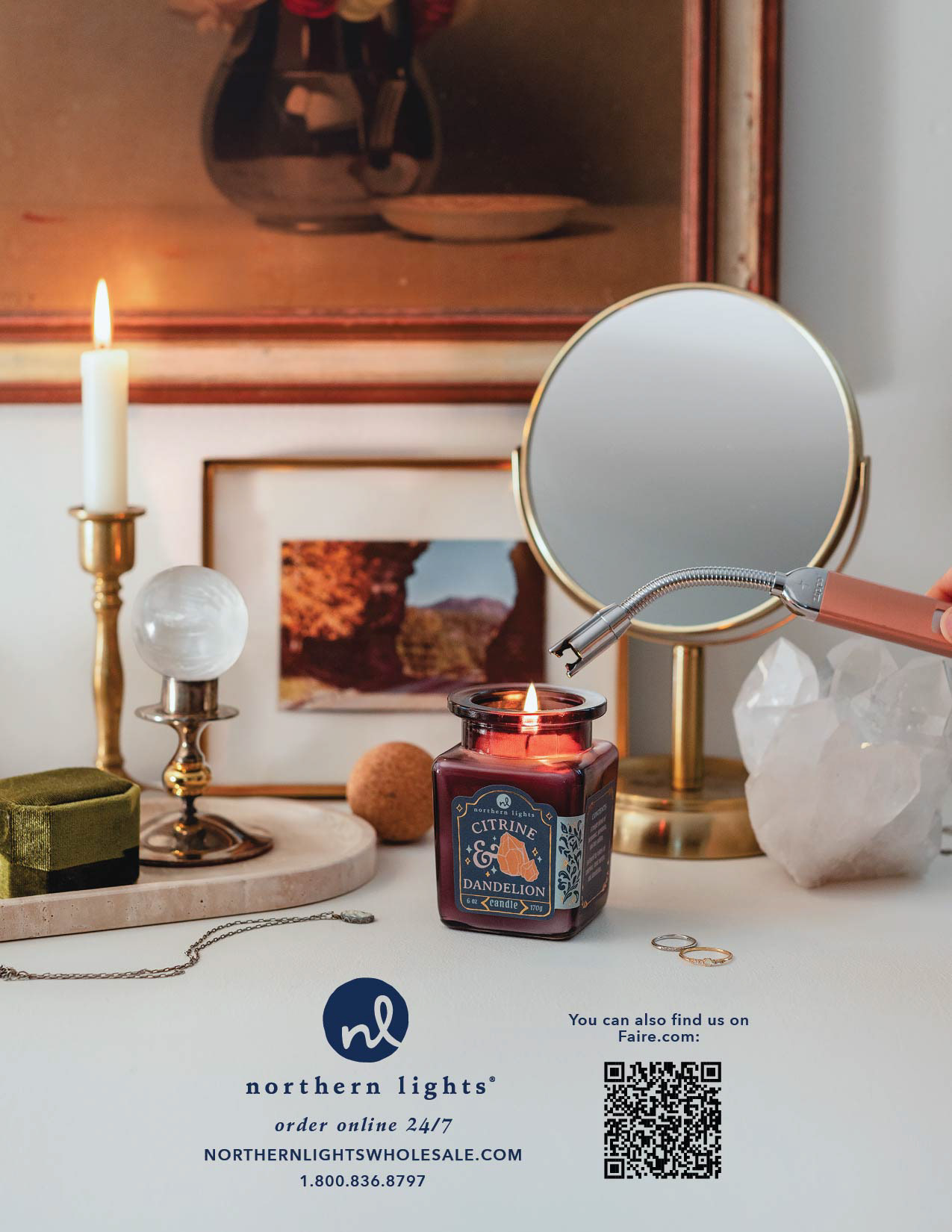
Photography and Editing
Cover Photo
After receiving this set of photos, I knew that I needed to adjust lighting and edit the window to have a nice outdoor scene. I also knew that the photos would need to be composited to show the background in focus as well as the foreground.
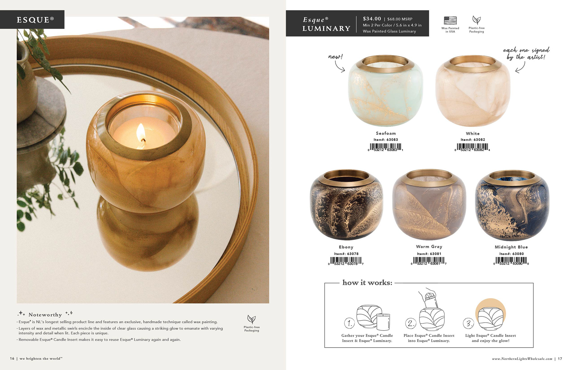
After that I could tell that the Esque® Luminary definitely needed color added to show that it was the new Seafoam color. As you can see there was some additional cleaning up needed, like the removal of the lamp cord and the threads hanging off of the couch.

ORIGINAL

ORIGINAL
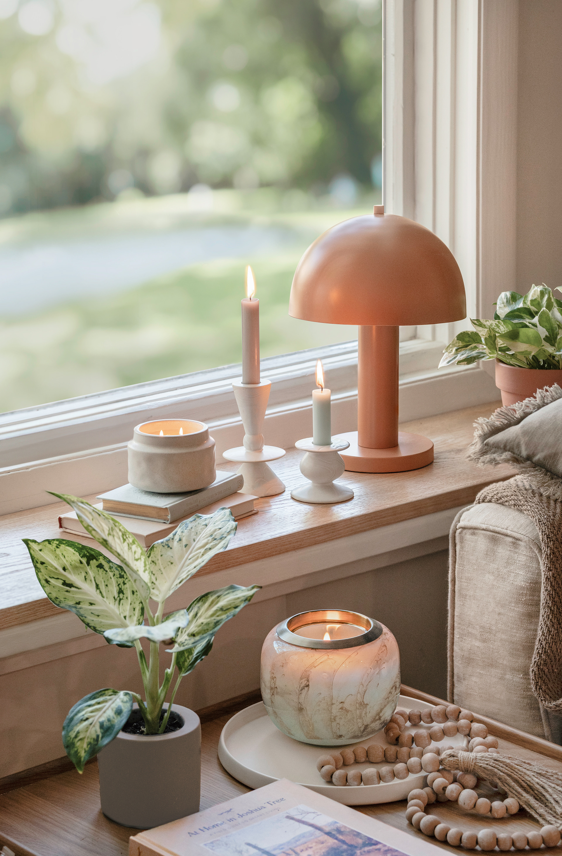
FINAL
Windward Collection Photo
After receiving this set of photos, I knew that I needed to composite three different photos in order to get the background and foreground in focus, as well as utilize the flames without all the reflections and glow that they cause.
After the initial compositing, there were some color adjustments between products, removal of reflections in the glass, lighting adjustments on the logo medallions, and cleaning up of the flowers. I also added a subtle palm frond shadow to point to the coastal fragrances.

ORIGINAL

ORIGINAL
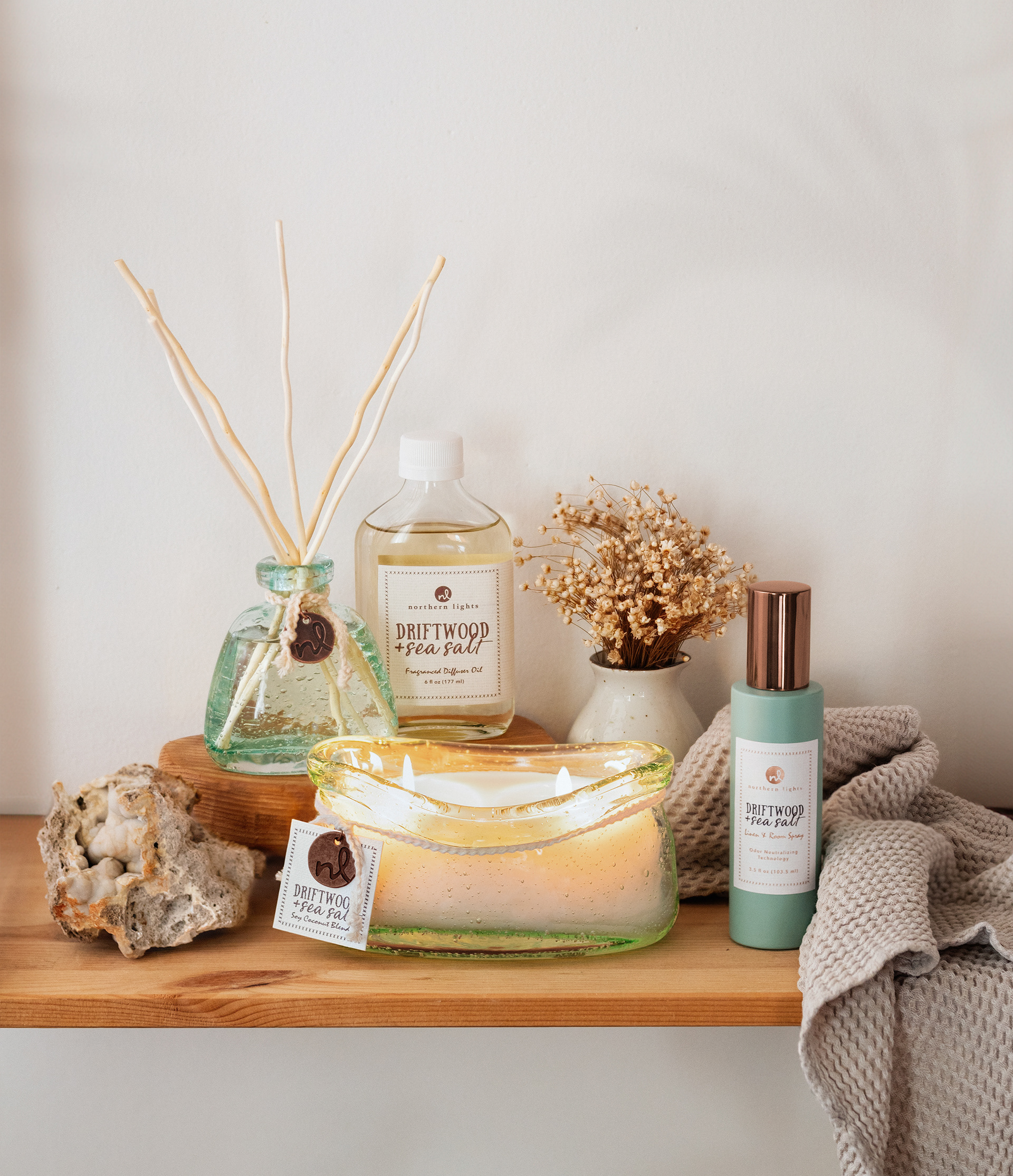
FINAL
Windward Room Spray Photo
This photo was set up by me and taken by me. I knew that I would need to edit the foil on the label to match the cap better, we were working with sample labels from our vendor so the foil wasn't quite right.
I did add some blur to some of the textures around the room spray because everything was a little too in focus and the textures were a little distracting.
Once this photo was on the page in catalog, it was clear that the whole photo needed a slight angle, it was looking very soldier-y and straight up on the page with the clipped versions of the product.
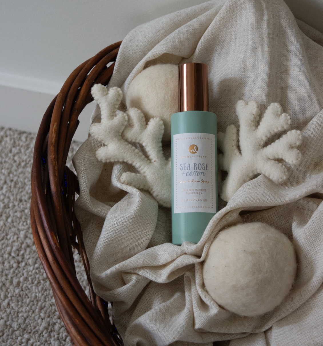
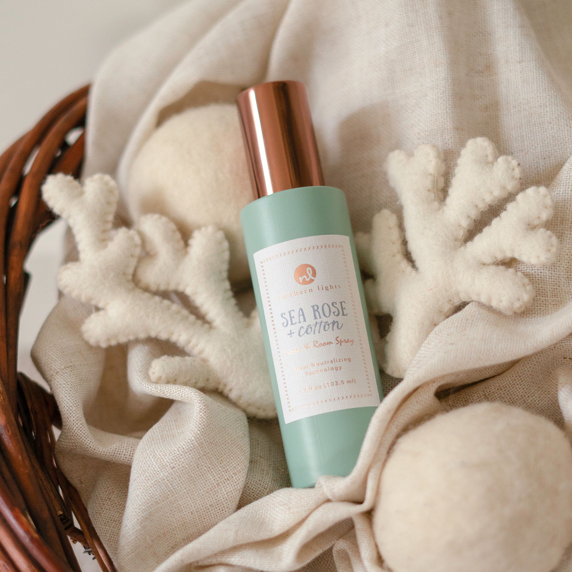
FINAL
PawsON Collection Photo
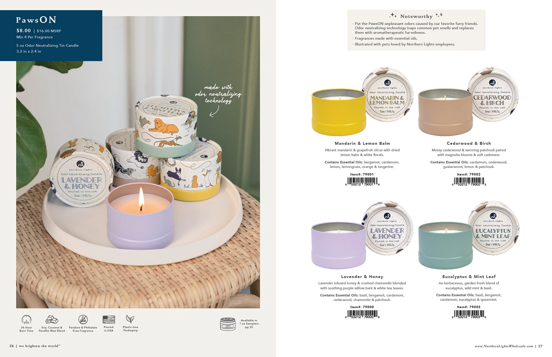
This photo was set up by me and taken by me. I set up the four candles in a way that the camera could see almost every illustrated pet as well as a few fragrance names.
Taking this photo was actually such a tight squeeze because this space was so small. I had the camera up against the glass window on the side to get far enough back and a colleague outside the glass telling me if the candles were even in focus!
I knew this photo needed to get brighter and that the plant needed to be moved inward toward the products a bit more.
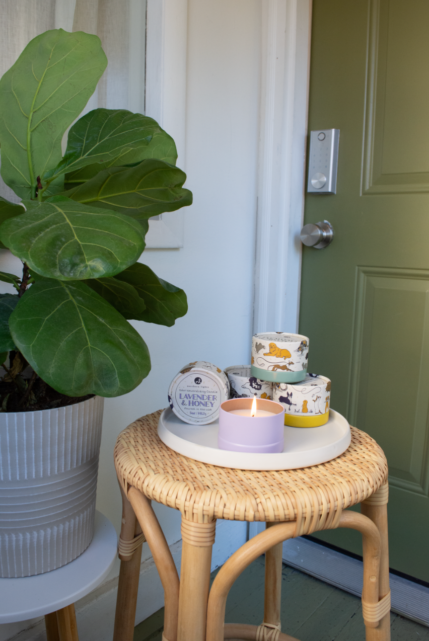
SET UP
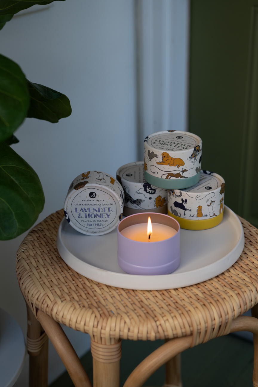
ORIGINAL
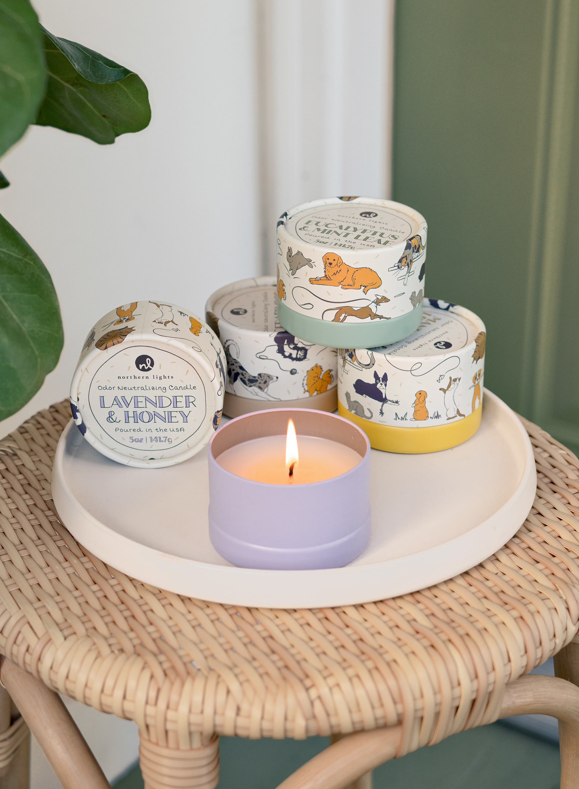
FINAL
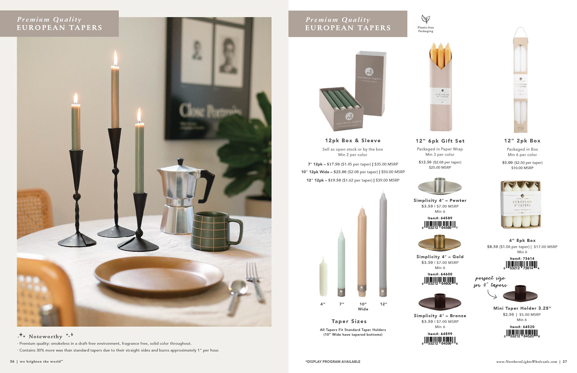
Tapers Photo
This photo was set up by my team and we workshopped and photographed together.
I knew that the poster on the wall and the plant needed to be raised up higher to allow for more breathing room above the coffee pot and the mug. I also needed to do a composite to get the middle taper in focus since it was the furthest back. Lastly, I adjusted the colors and was sure to remove the blue light on the black taper holders.
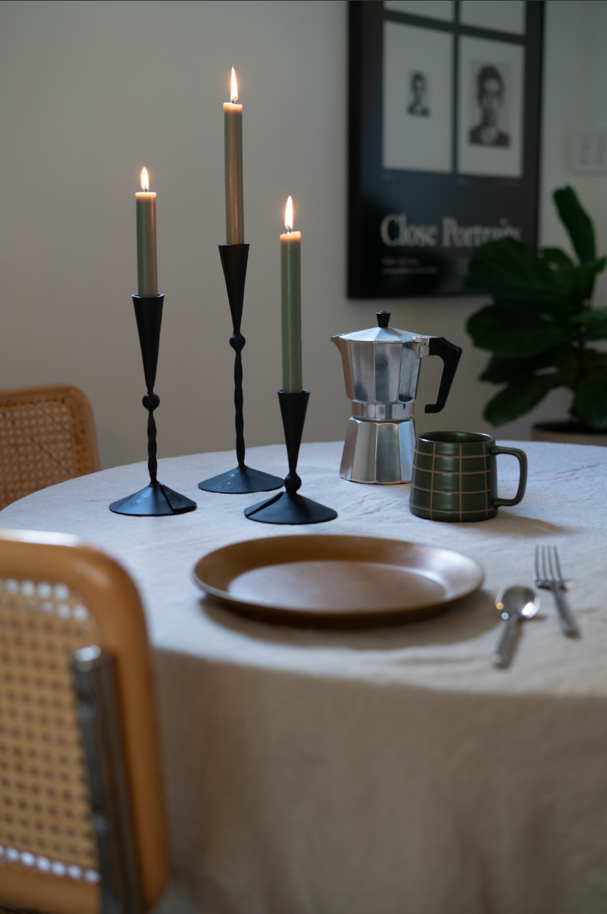
ORIGINAL
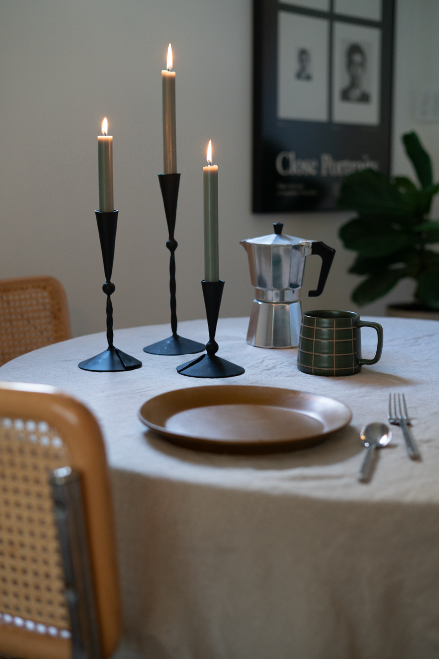
ORIGINAL
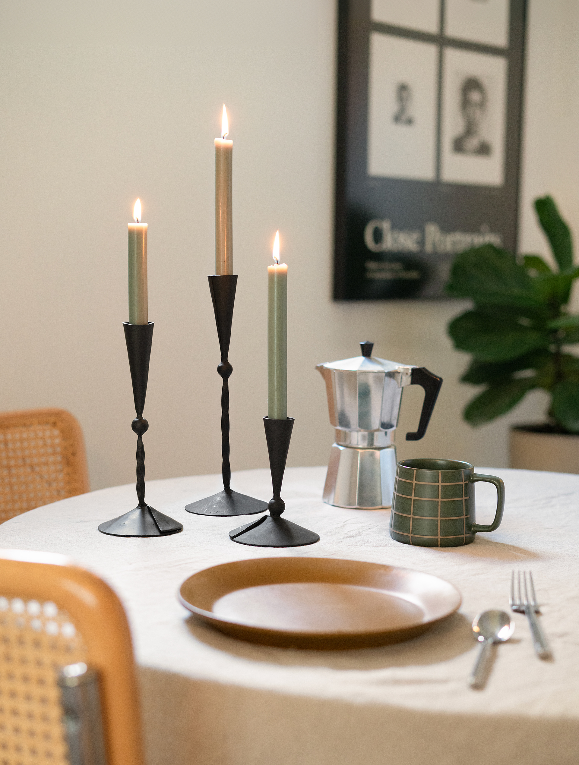
FINAL
Back Cover Photo
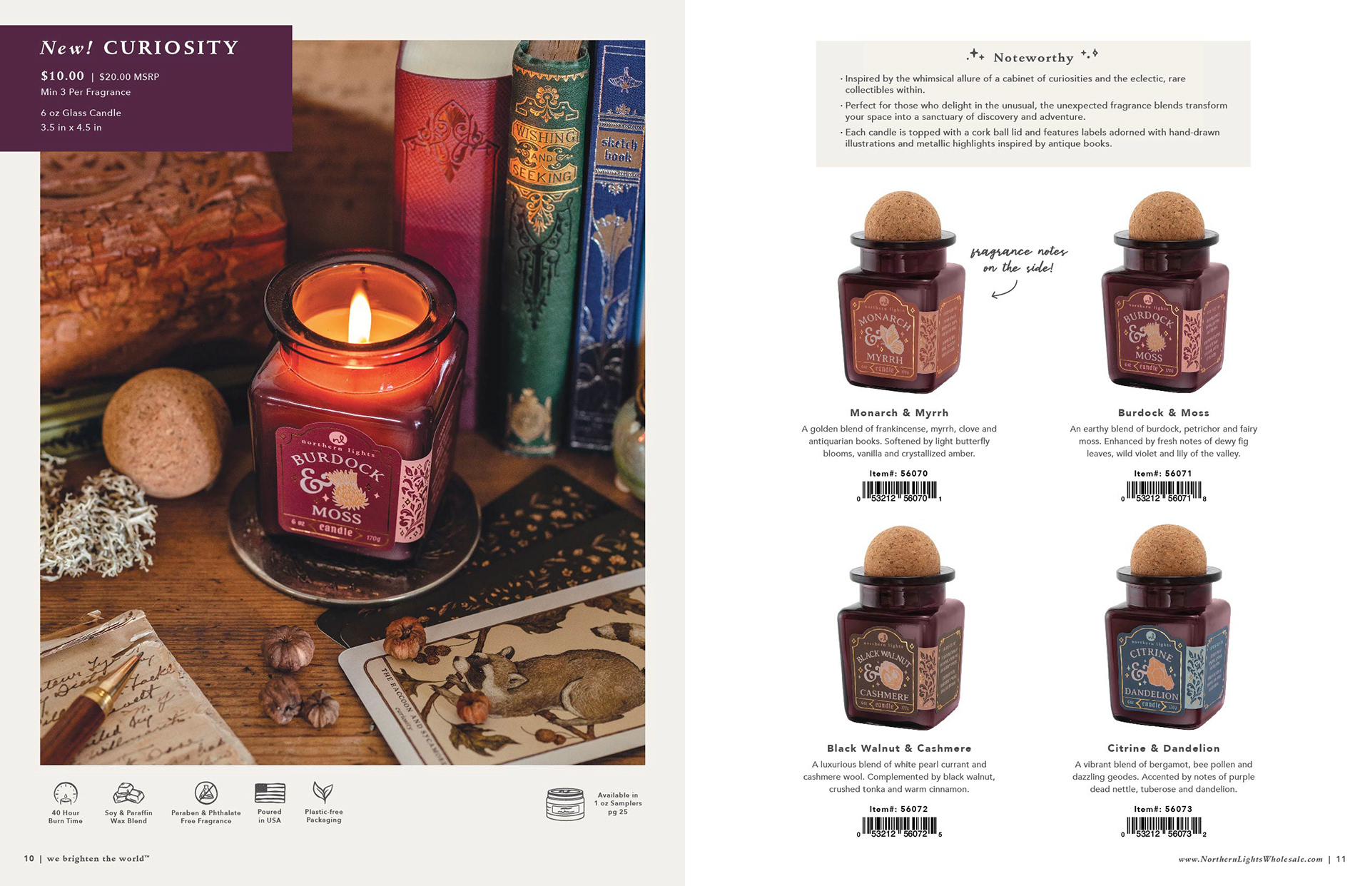
After receiving this set of photos, I knew that the lighting was much too warm and that the candle flame needed to be moved toward the center of the candle. After my initial edits, I received a lot of feedback.
My team was told that the photo was too "confusing" and that the scene needed to give a little more of the "collector of curiosities" vibes, so I added back in the rings, the necklace and the crystal ball while keeping one of the tapers. This was very challenging due to the glow left behind from the removed taper. This is one of the most composited photos in the catalog.

ORIGINAL

ORIGINAL
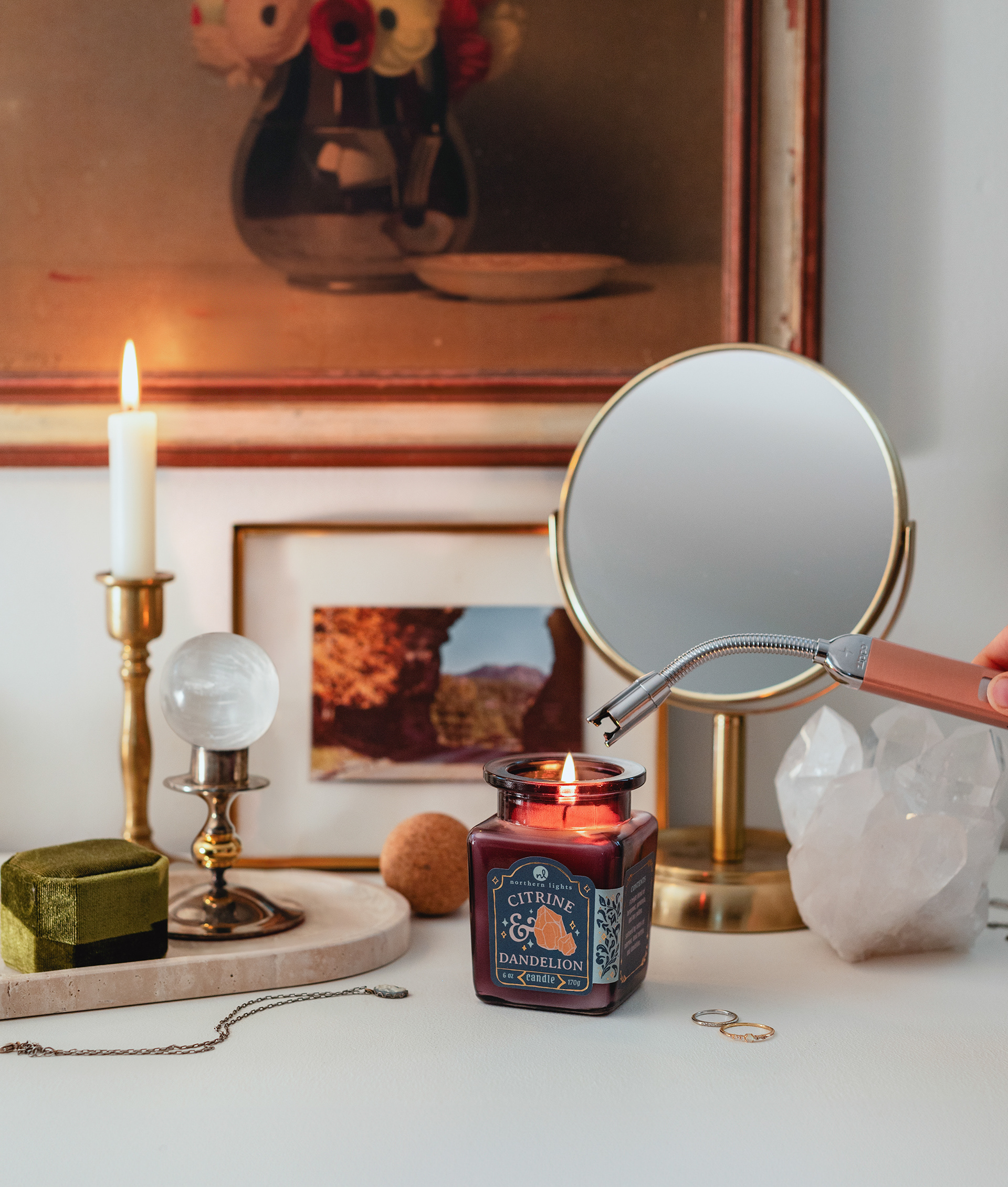
FINAL
Product Photos
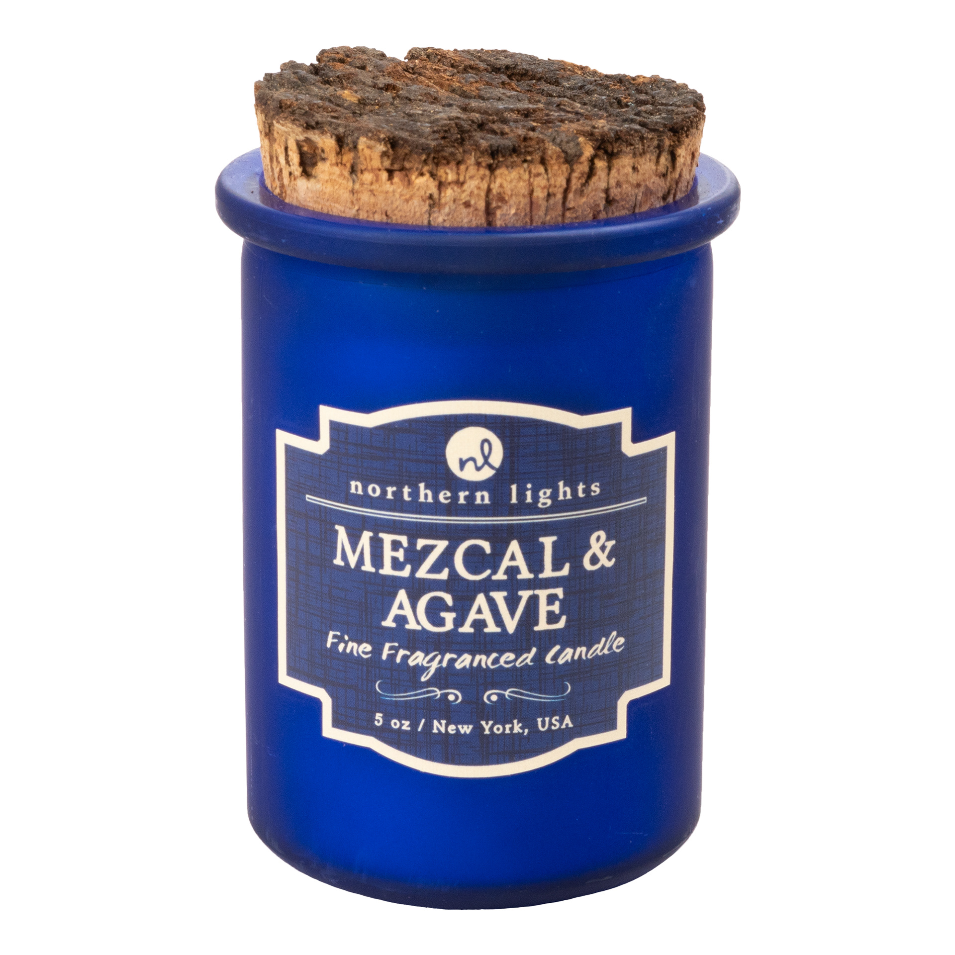
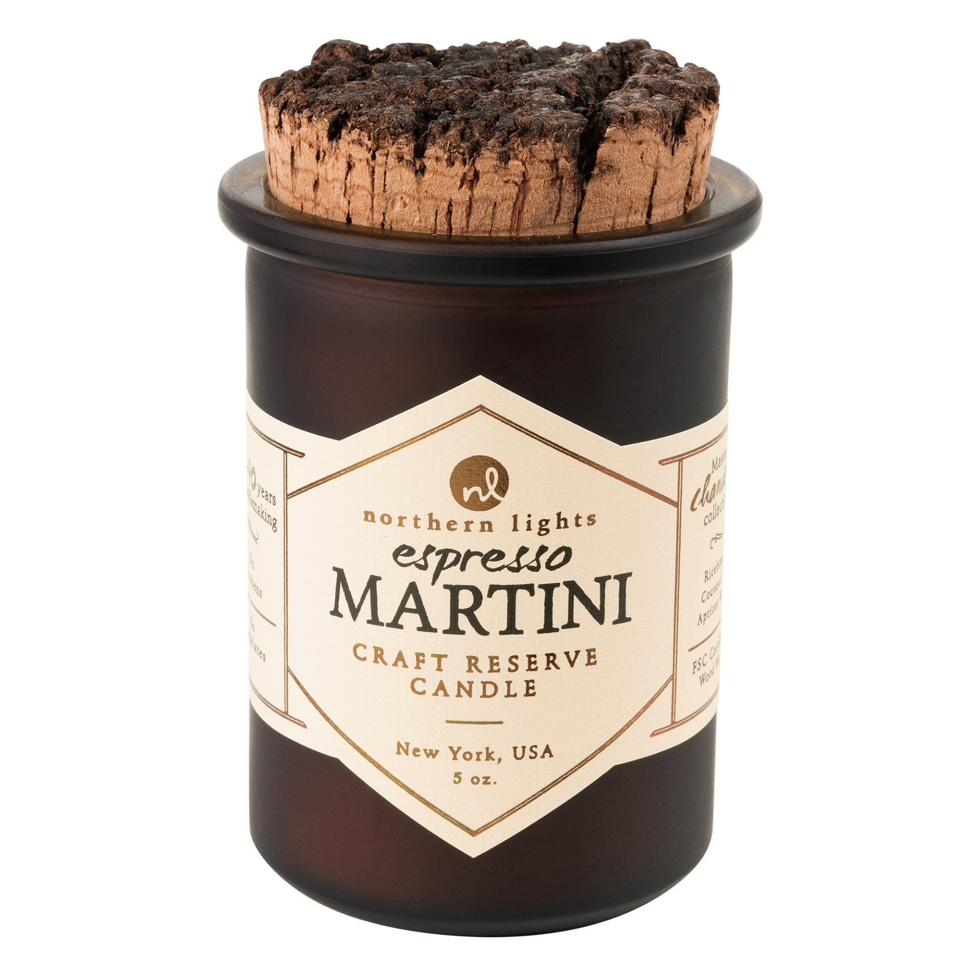
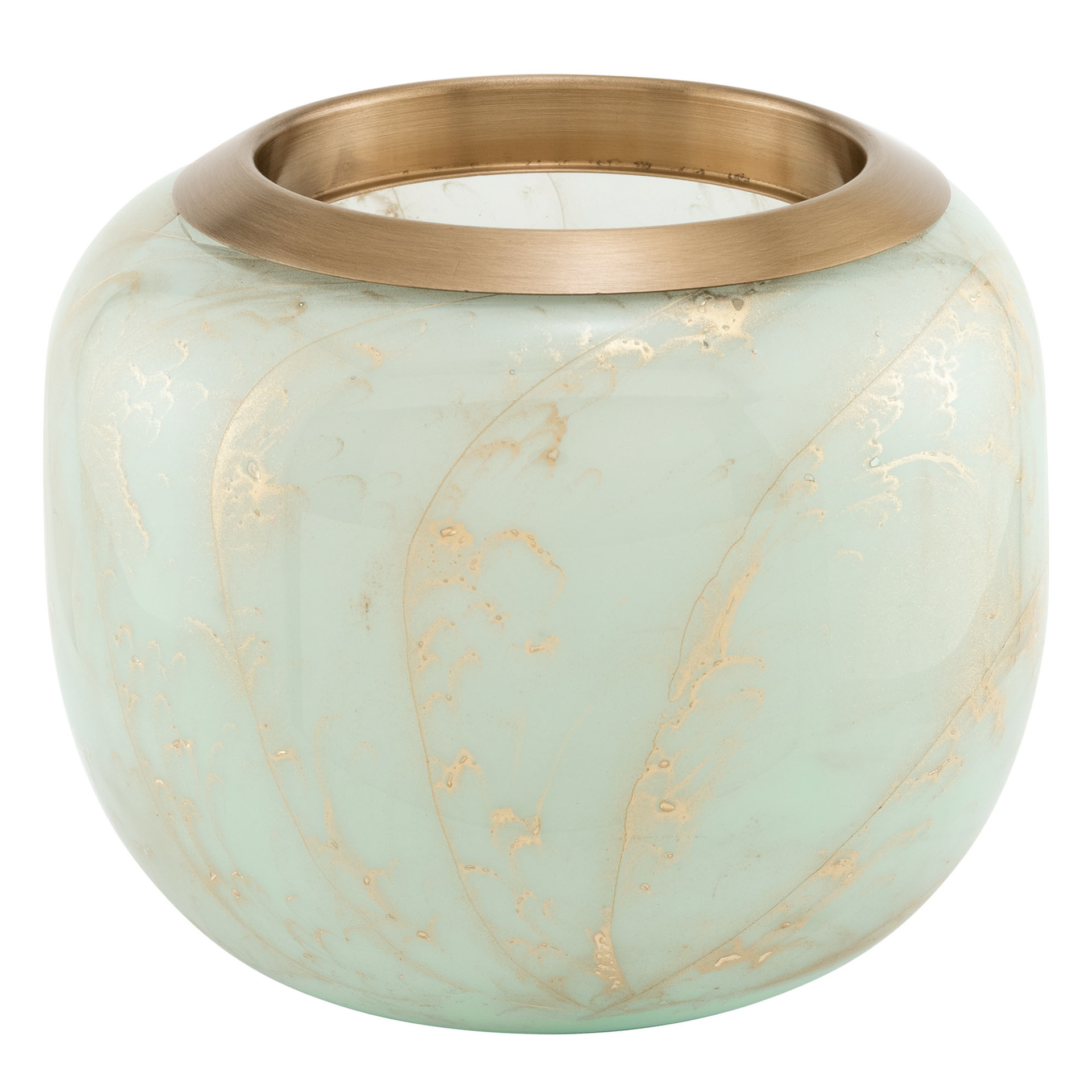
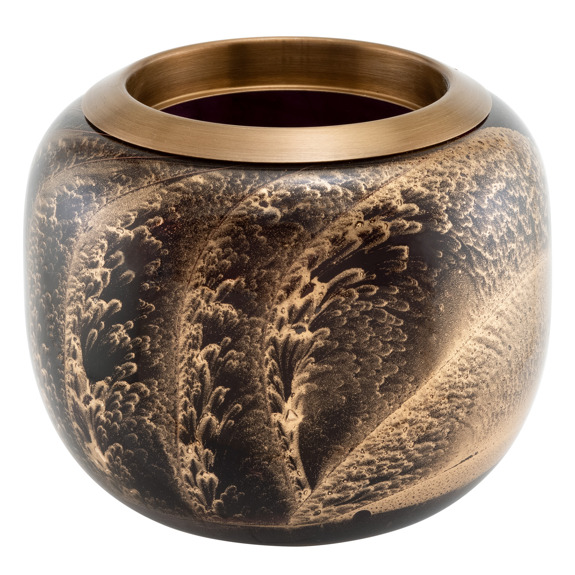
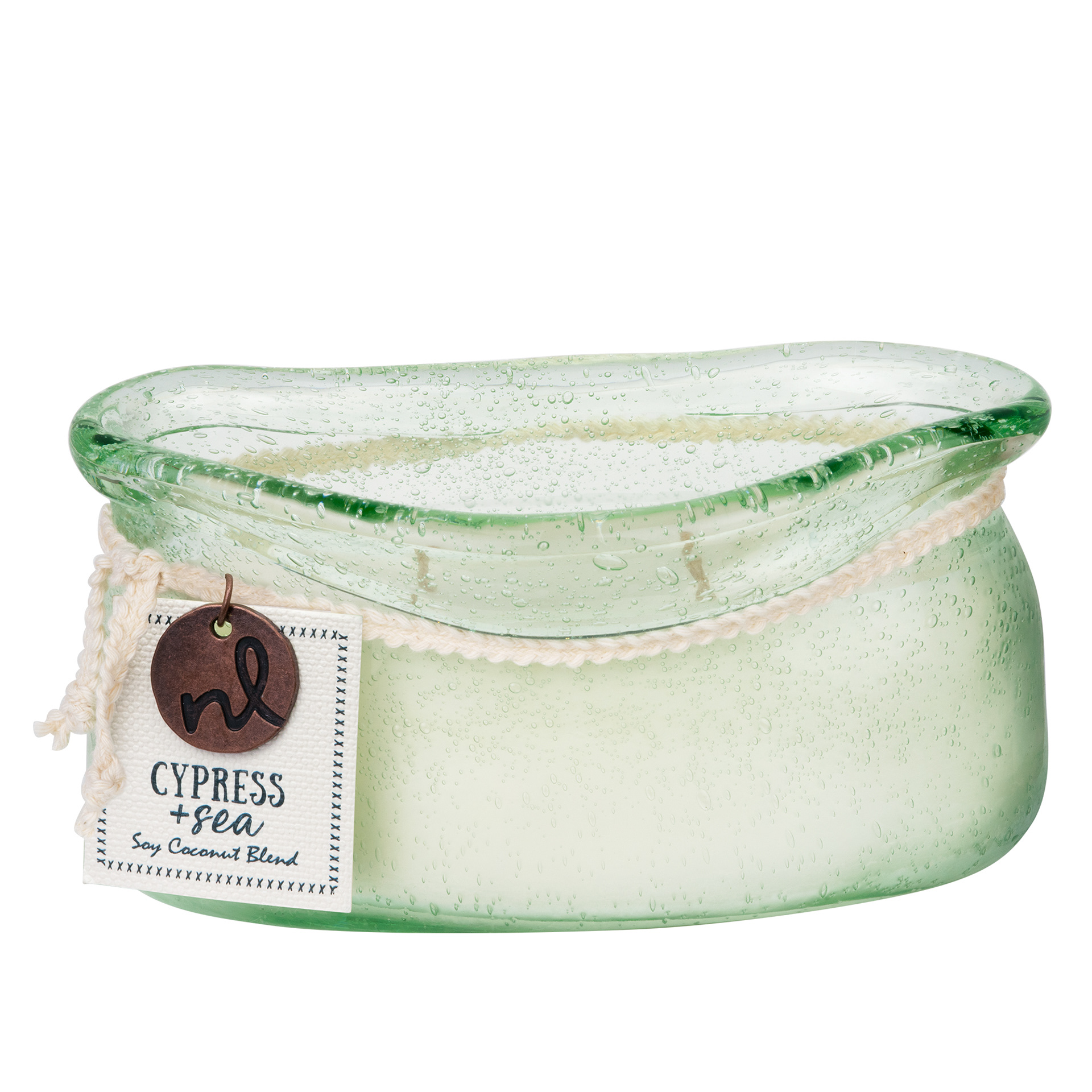
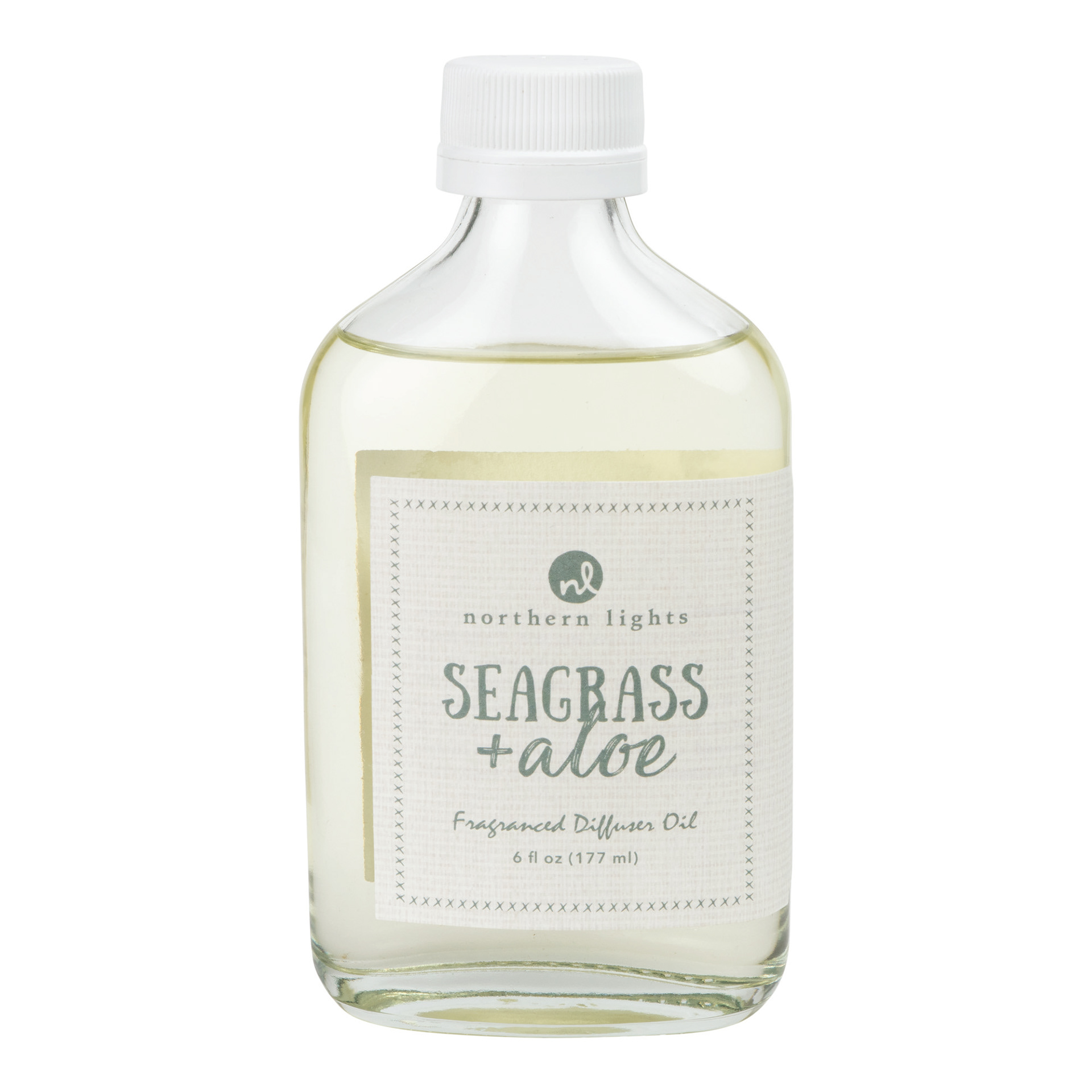
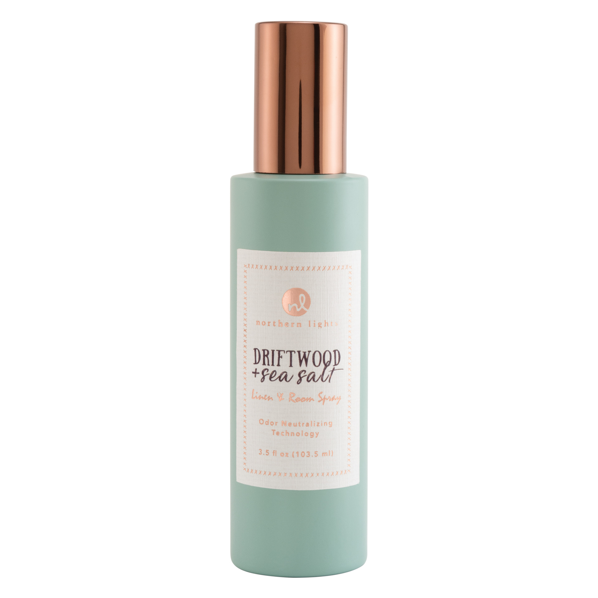
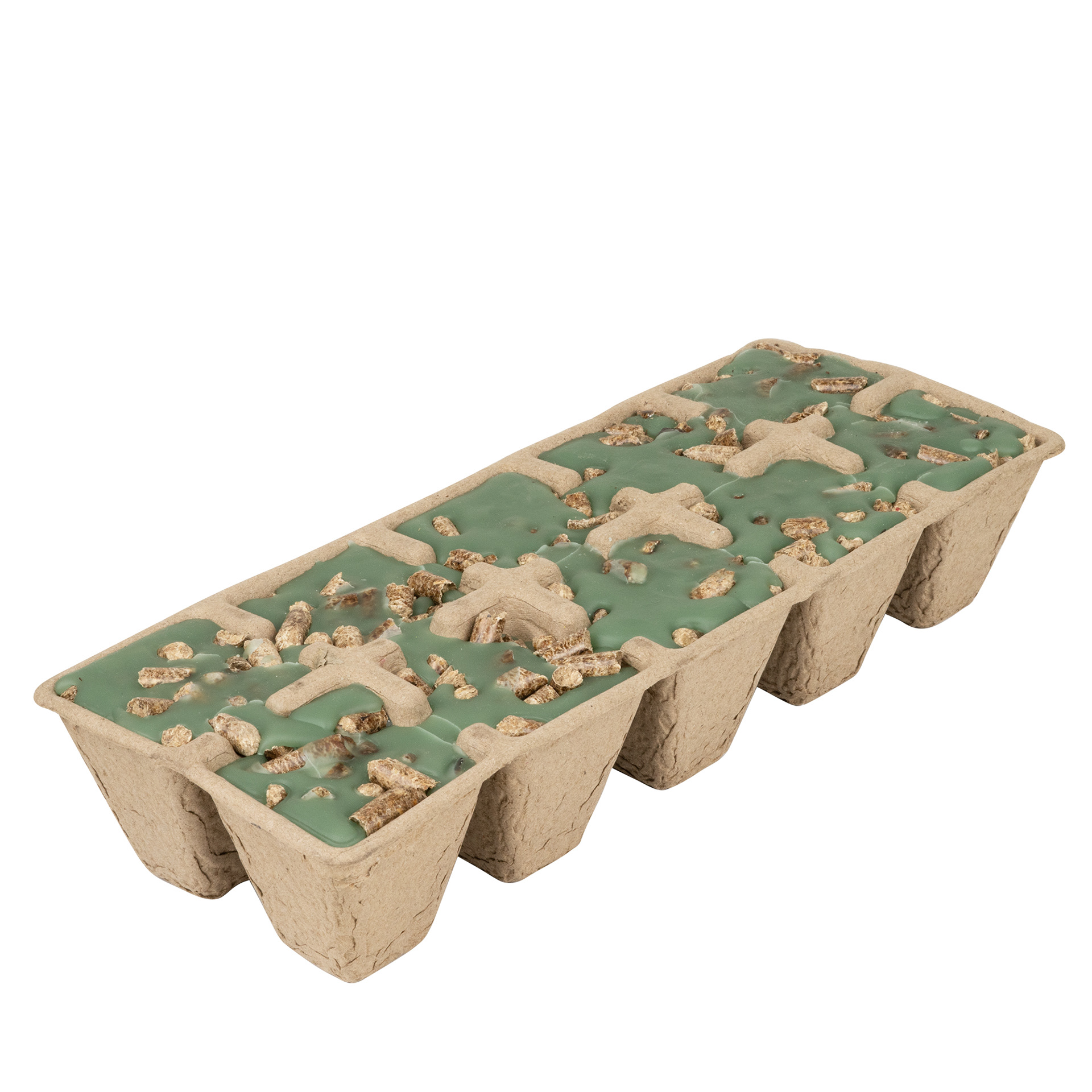
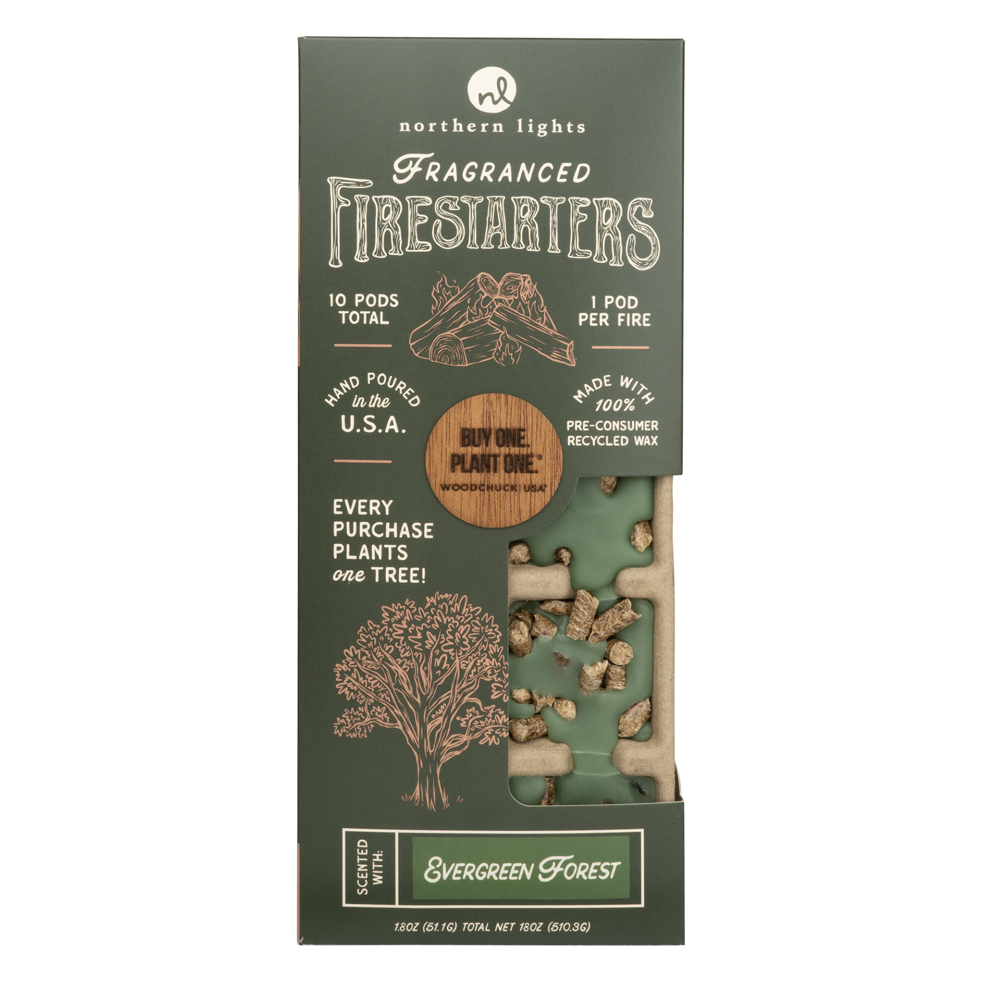
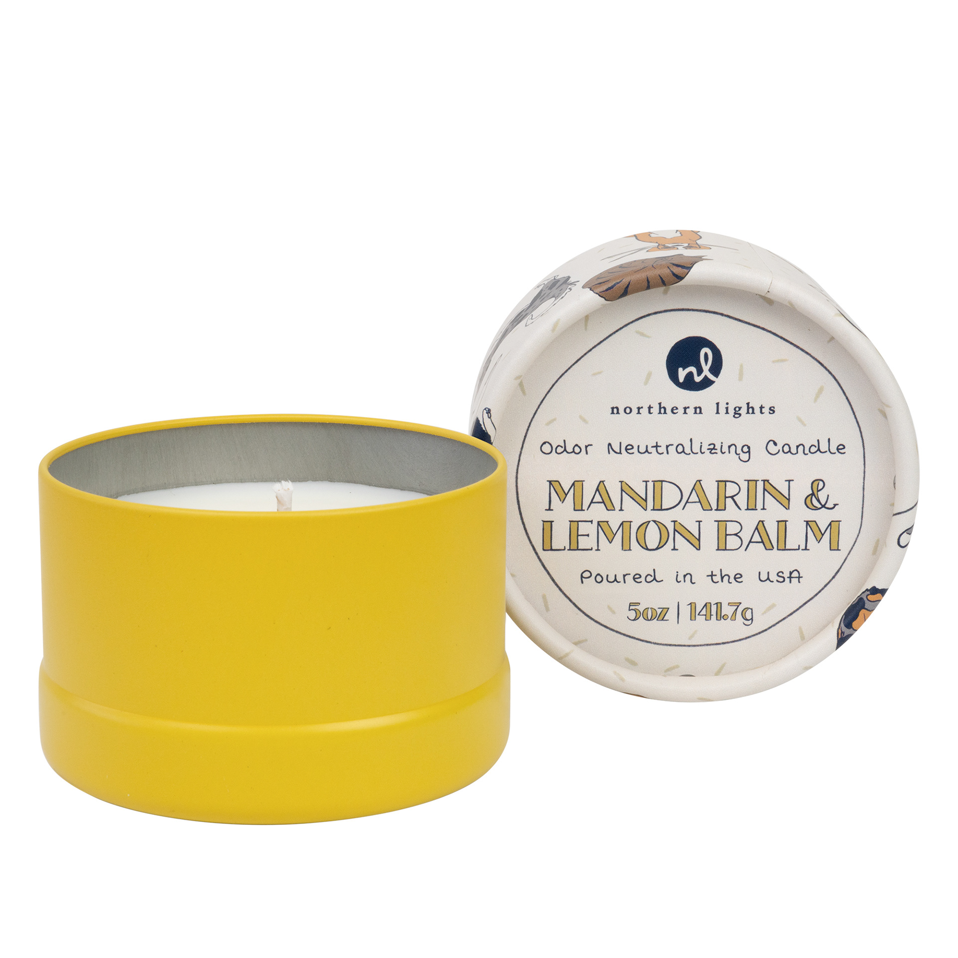
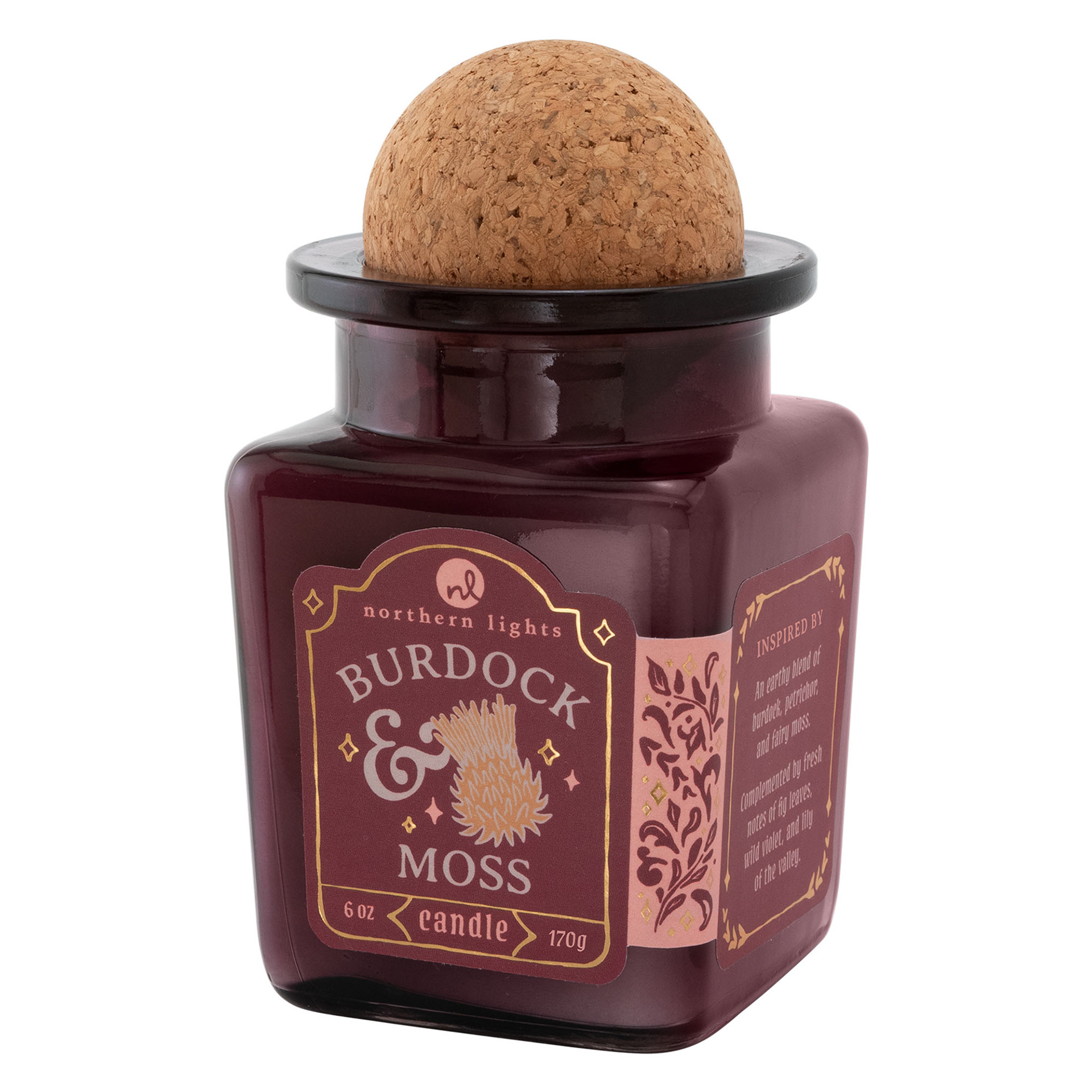
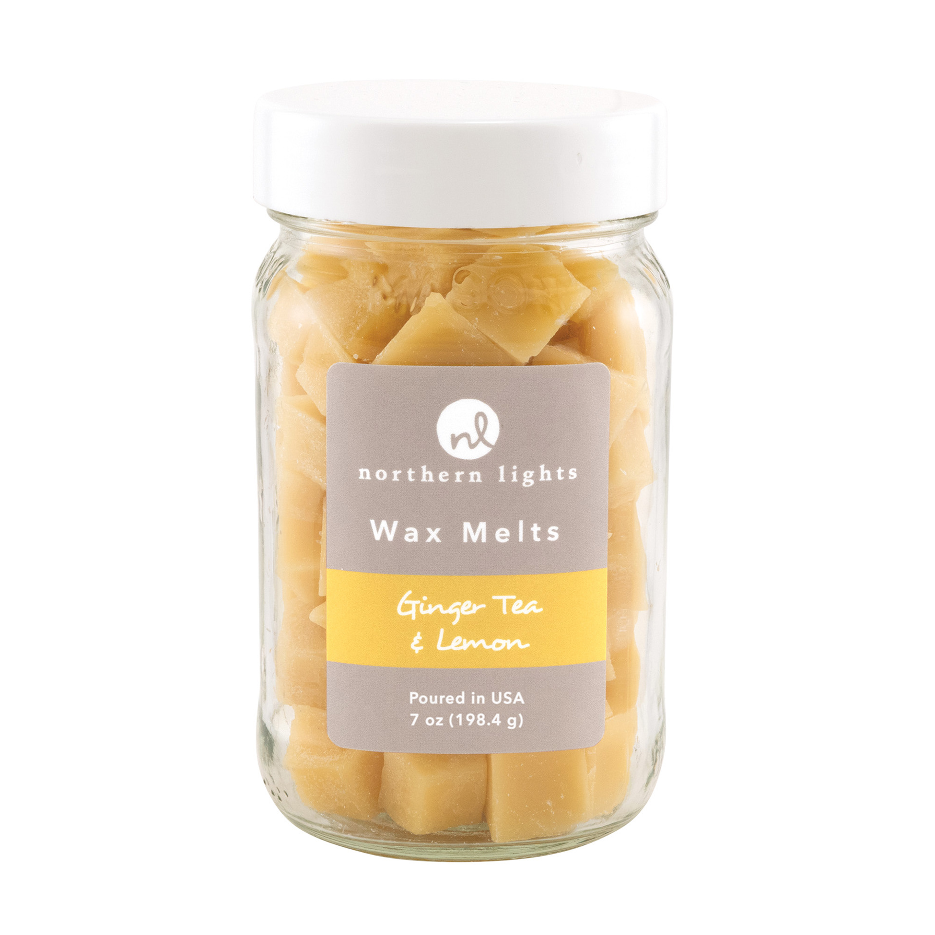
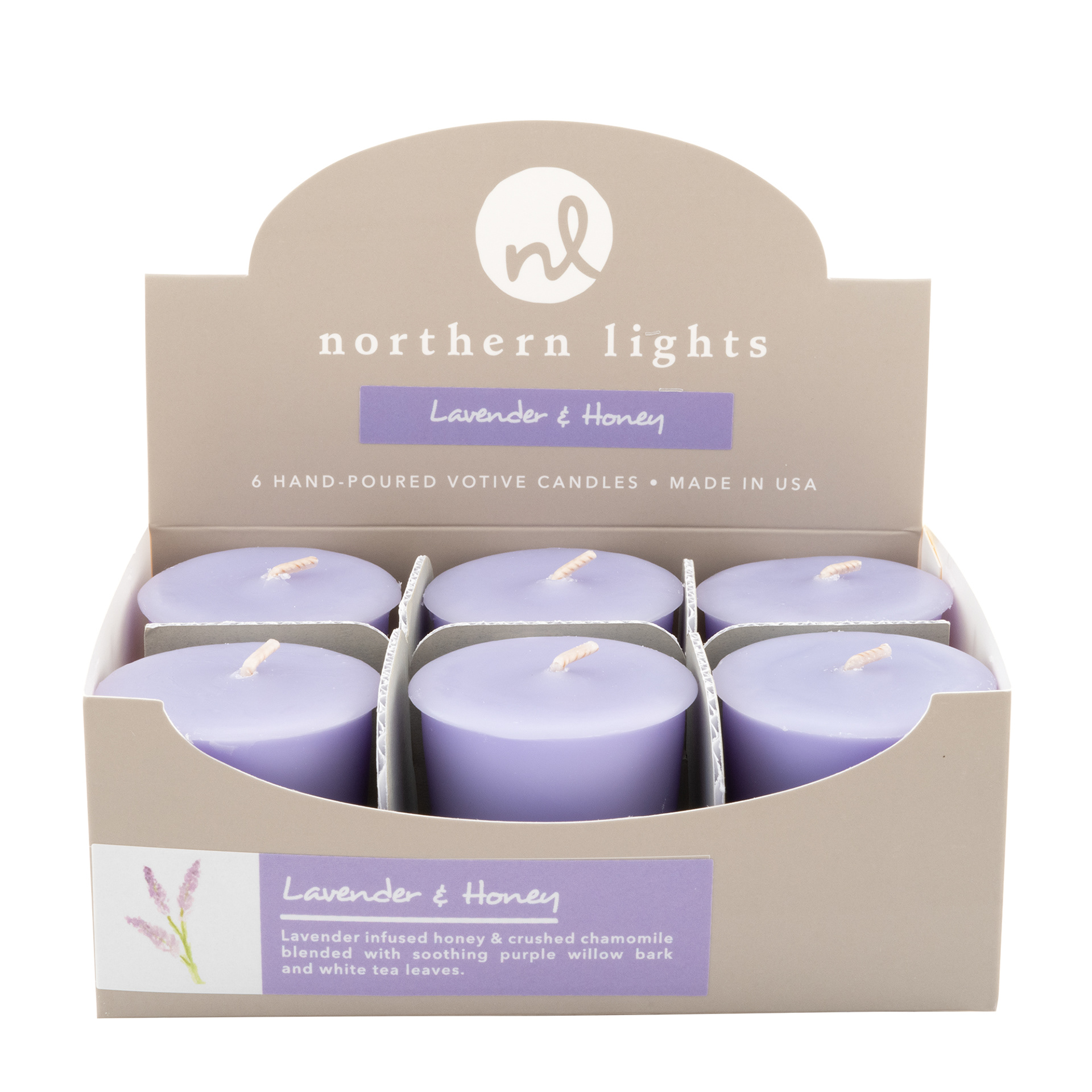
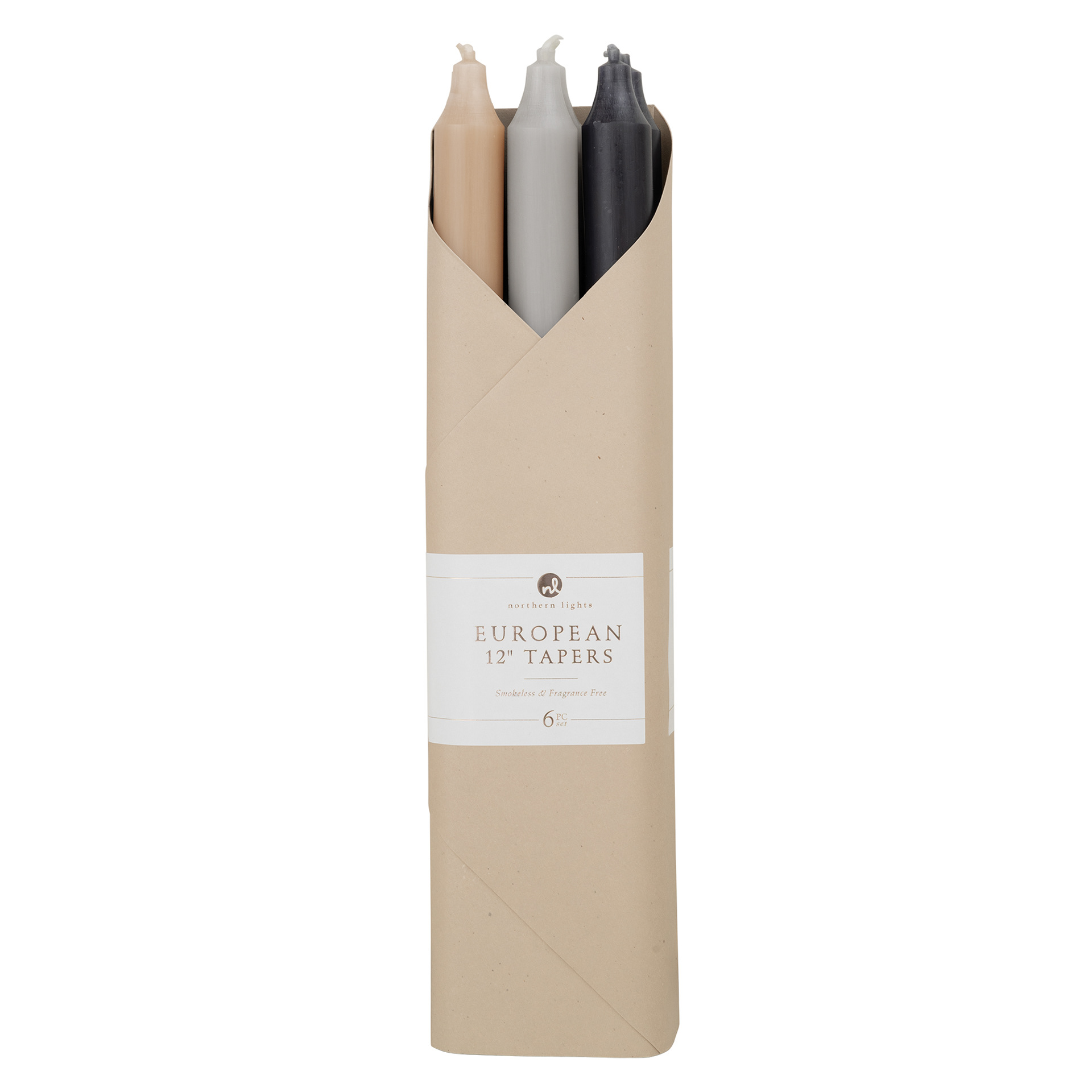
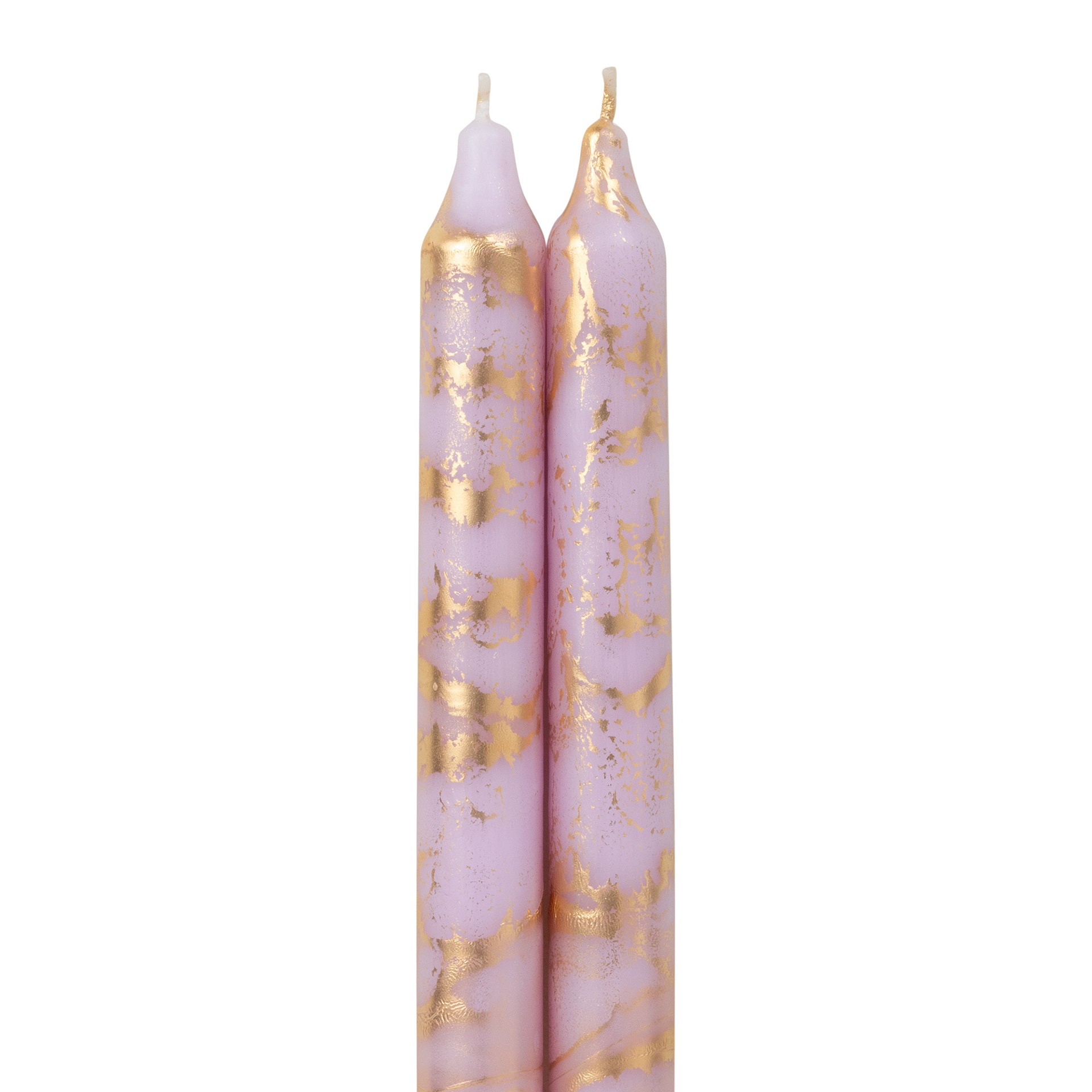
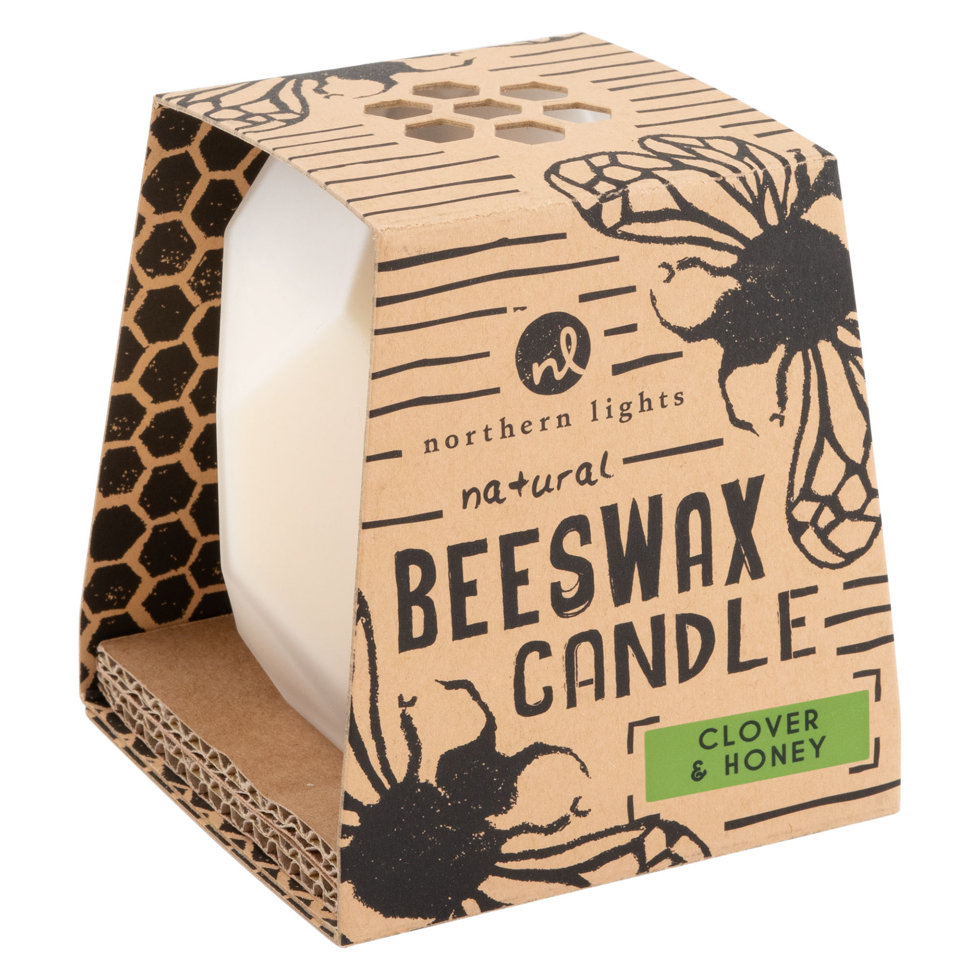
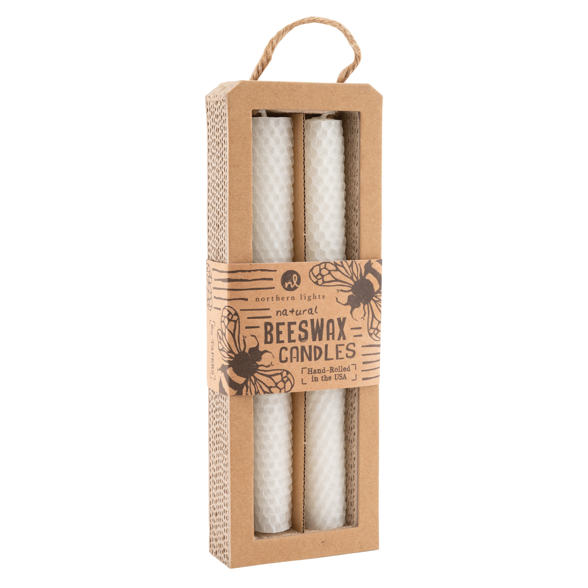
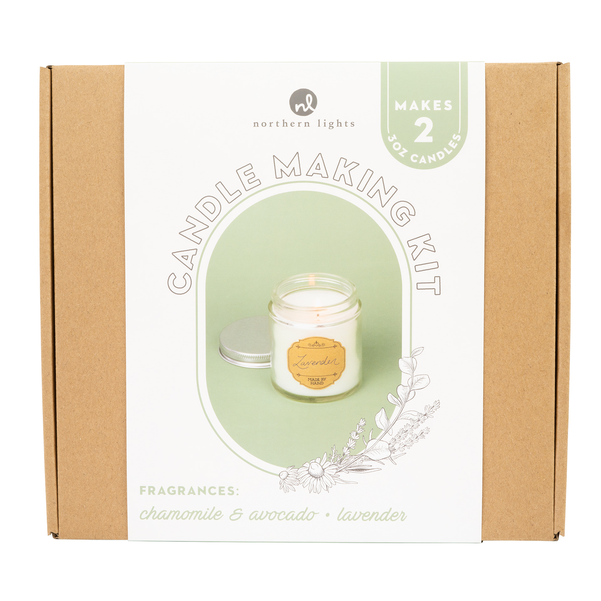
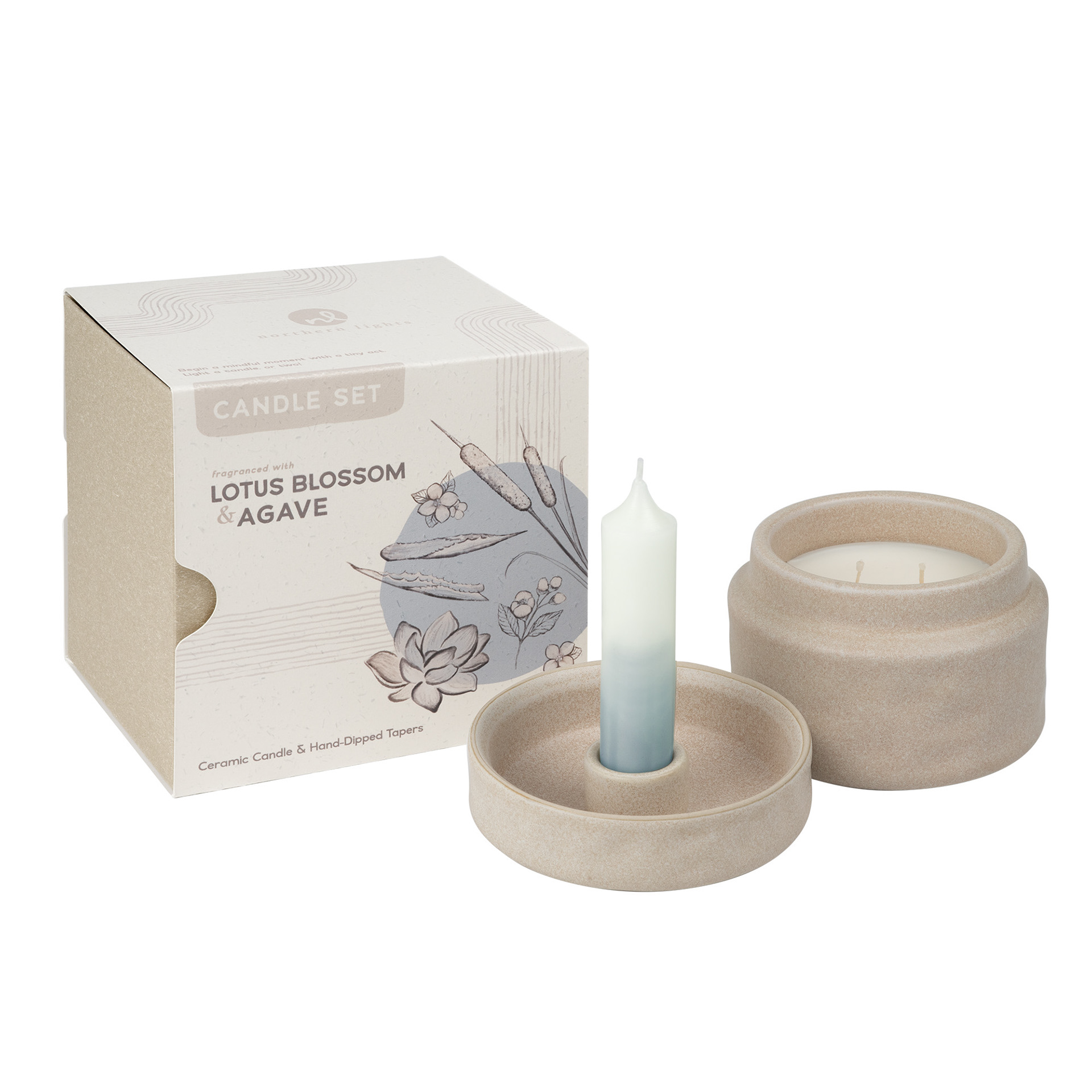
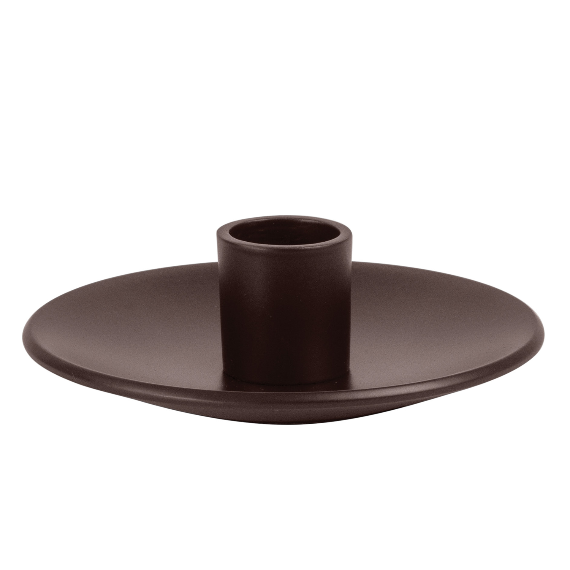
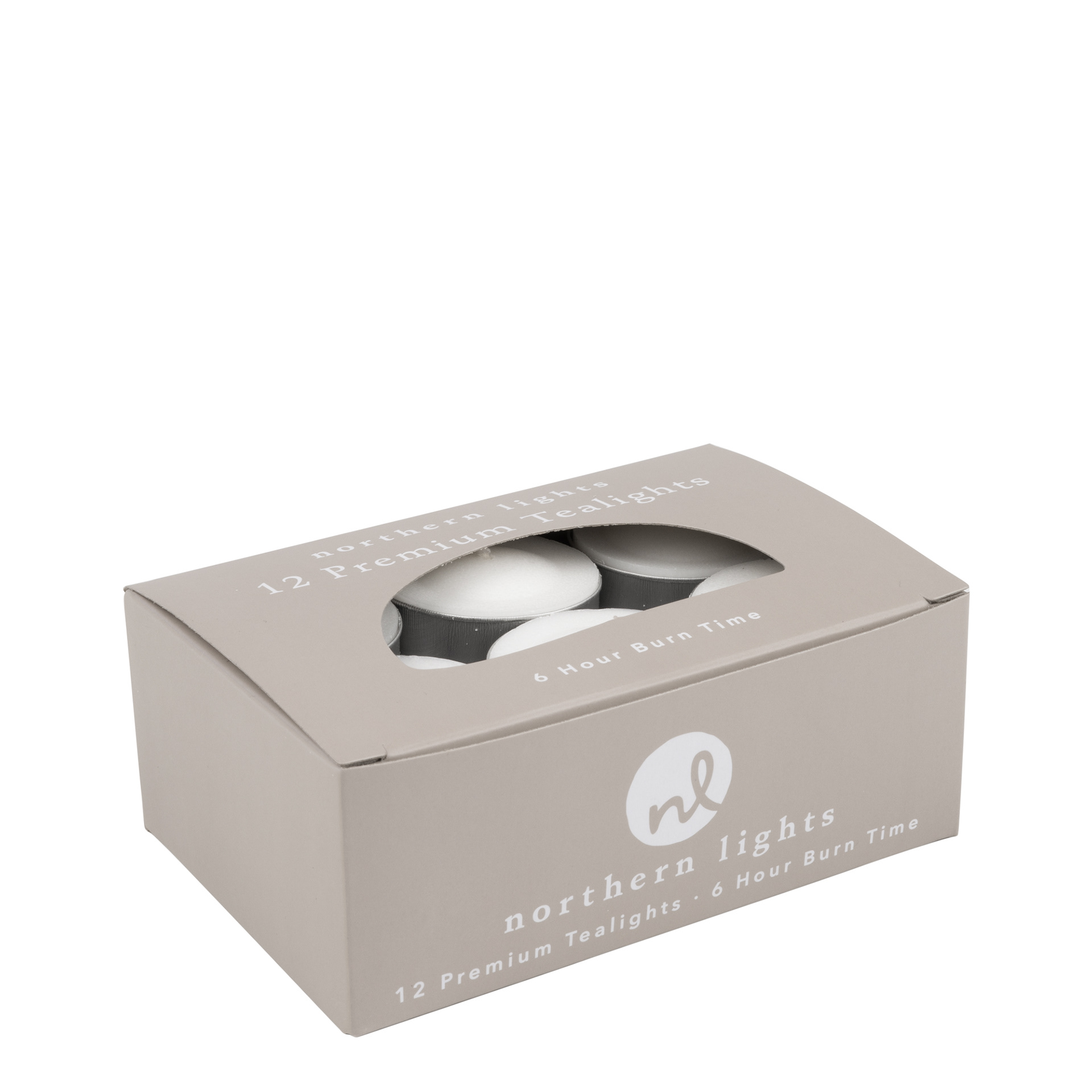
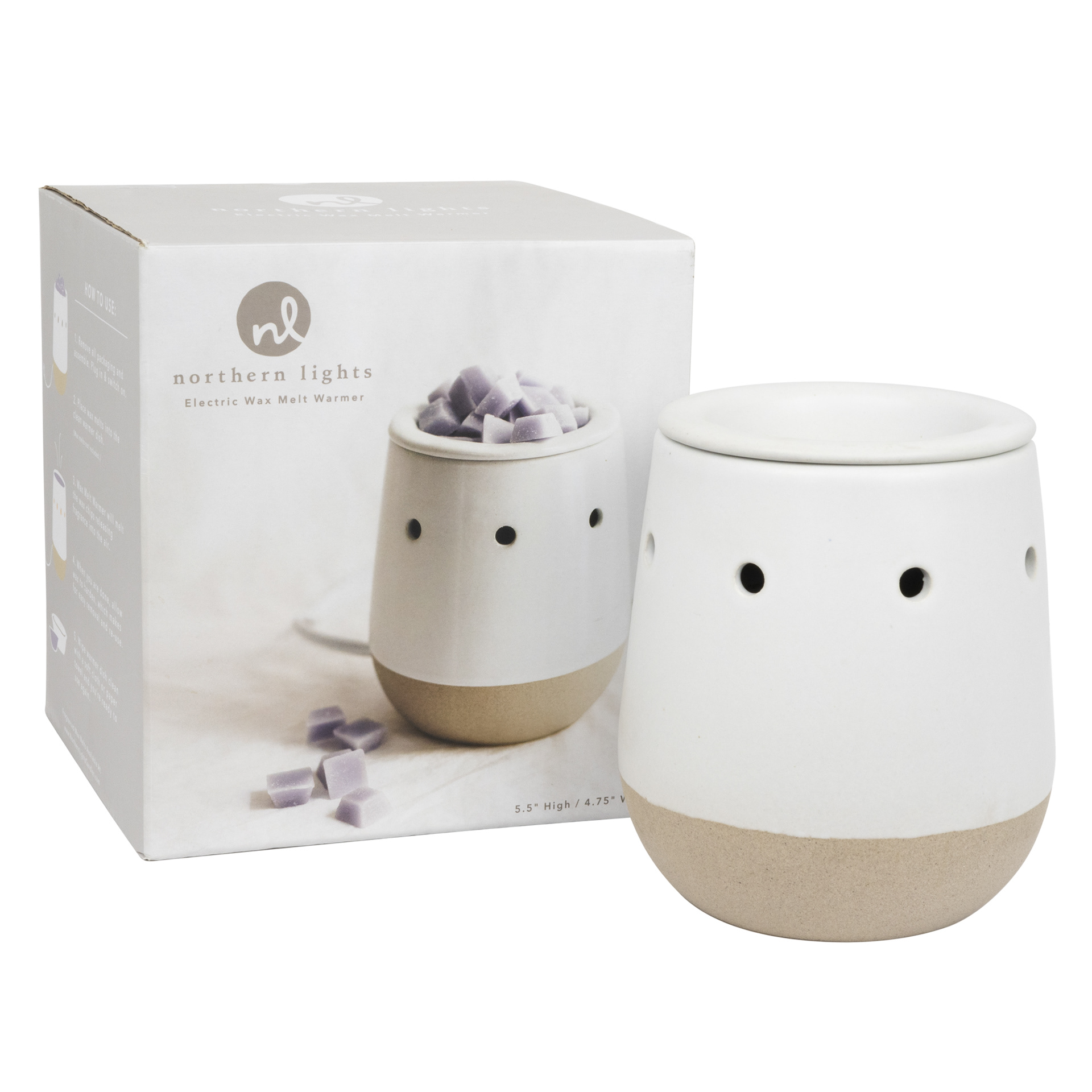
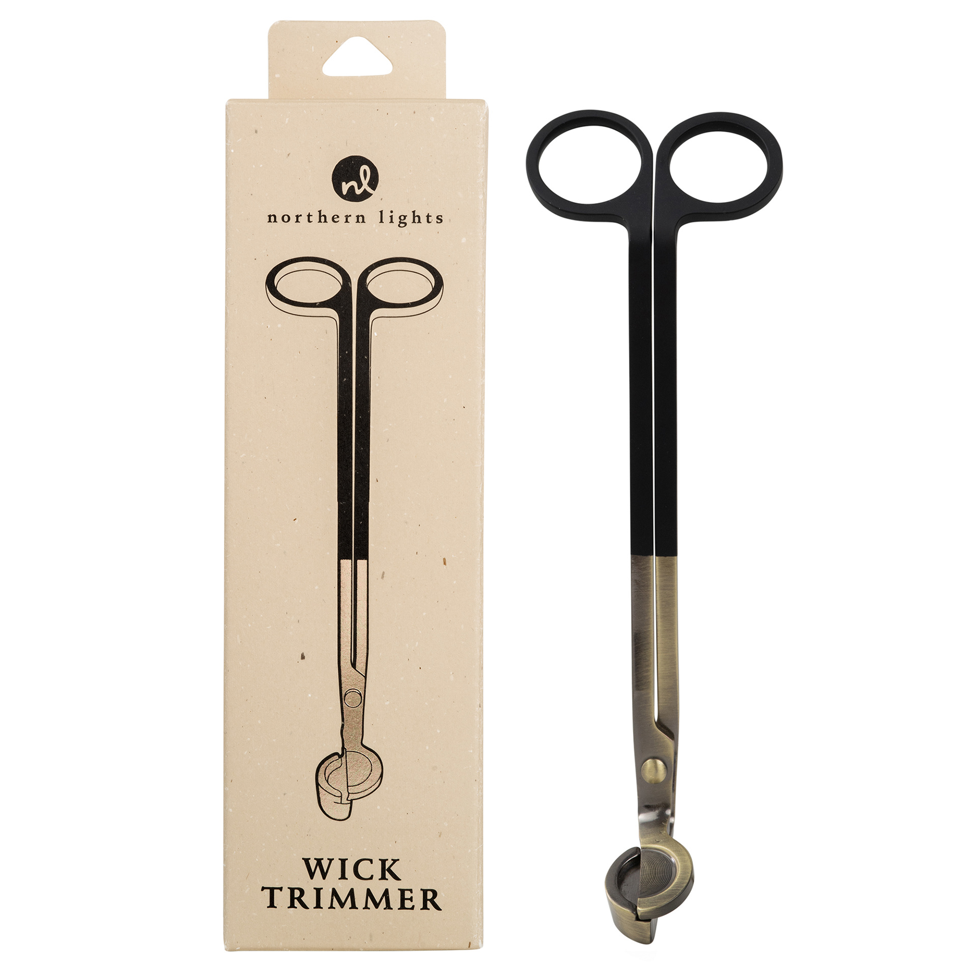
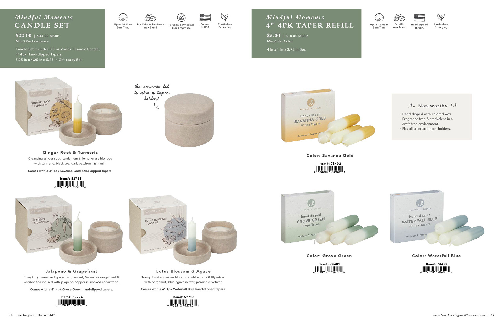
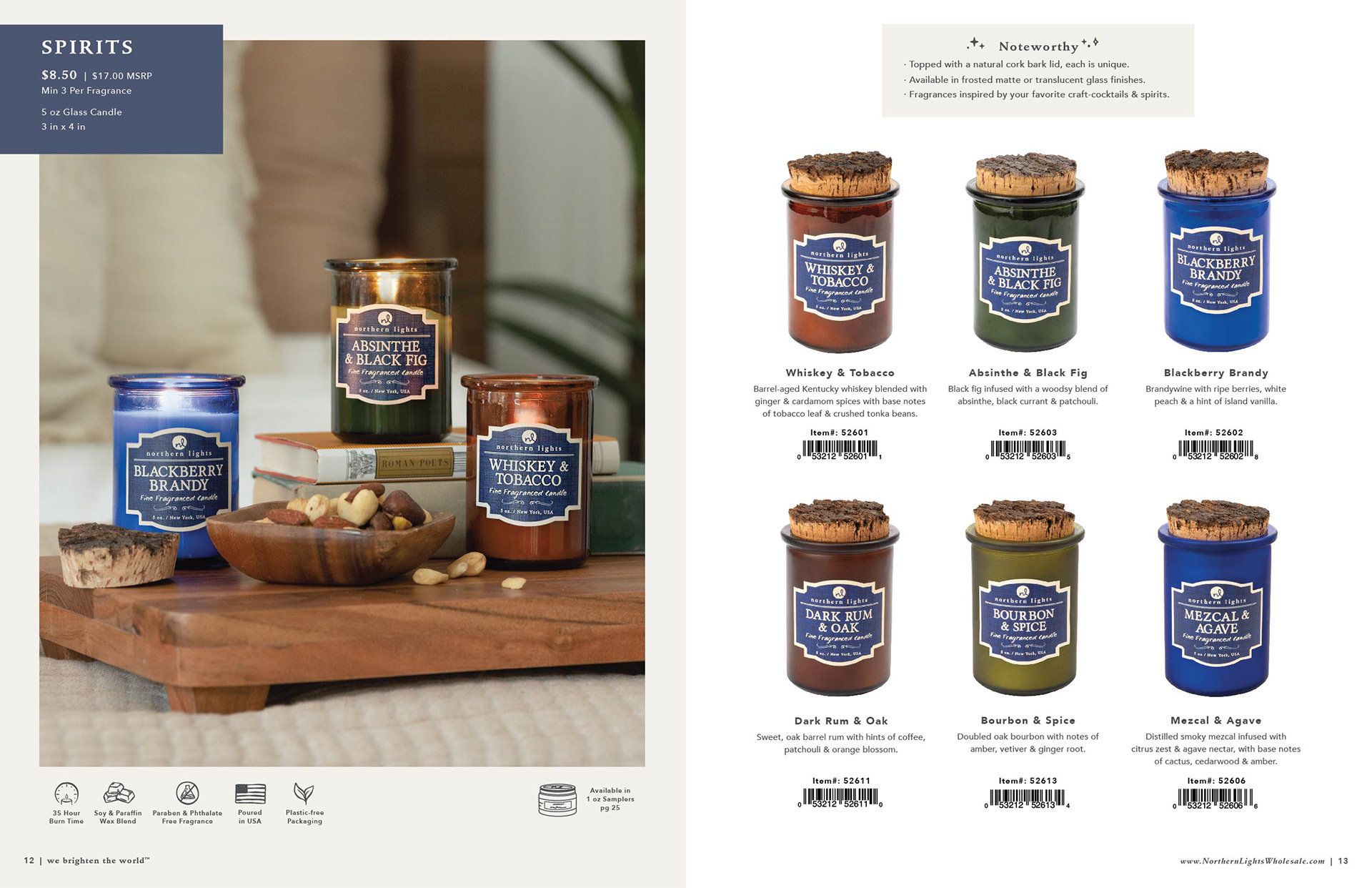
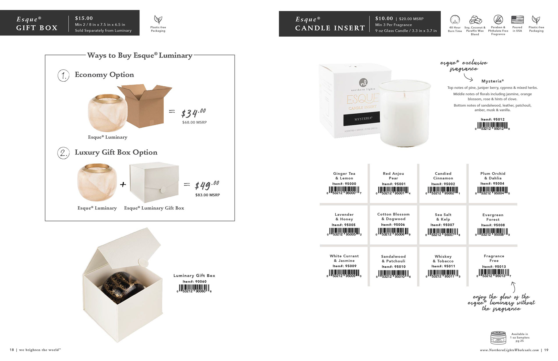
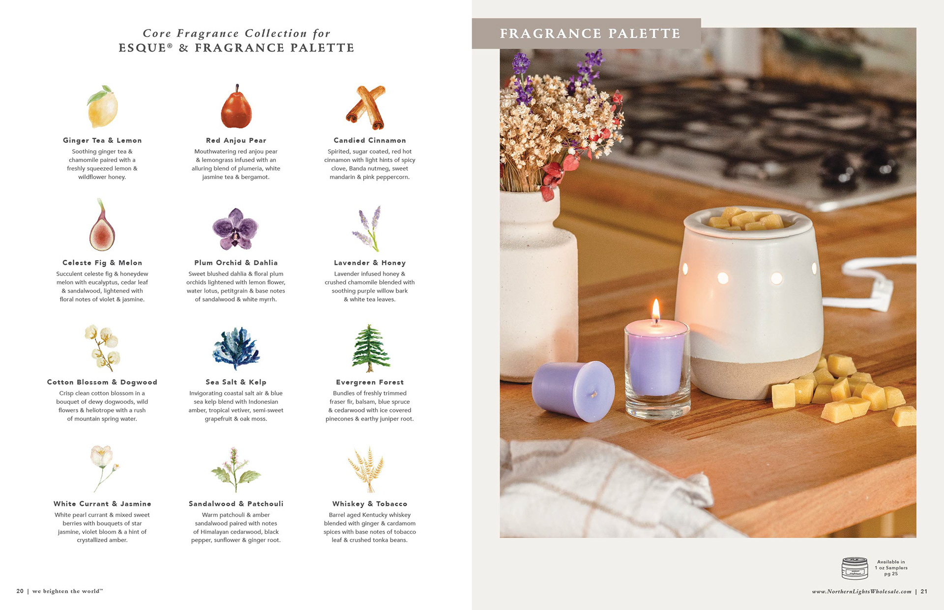
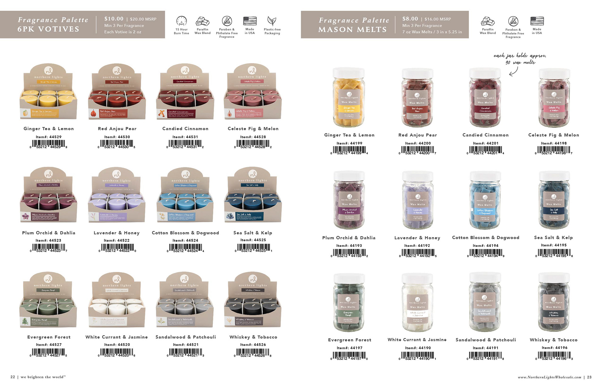
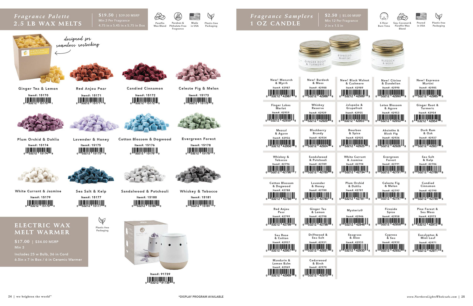
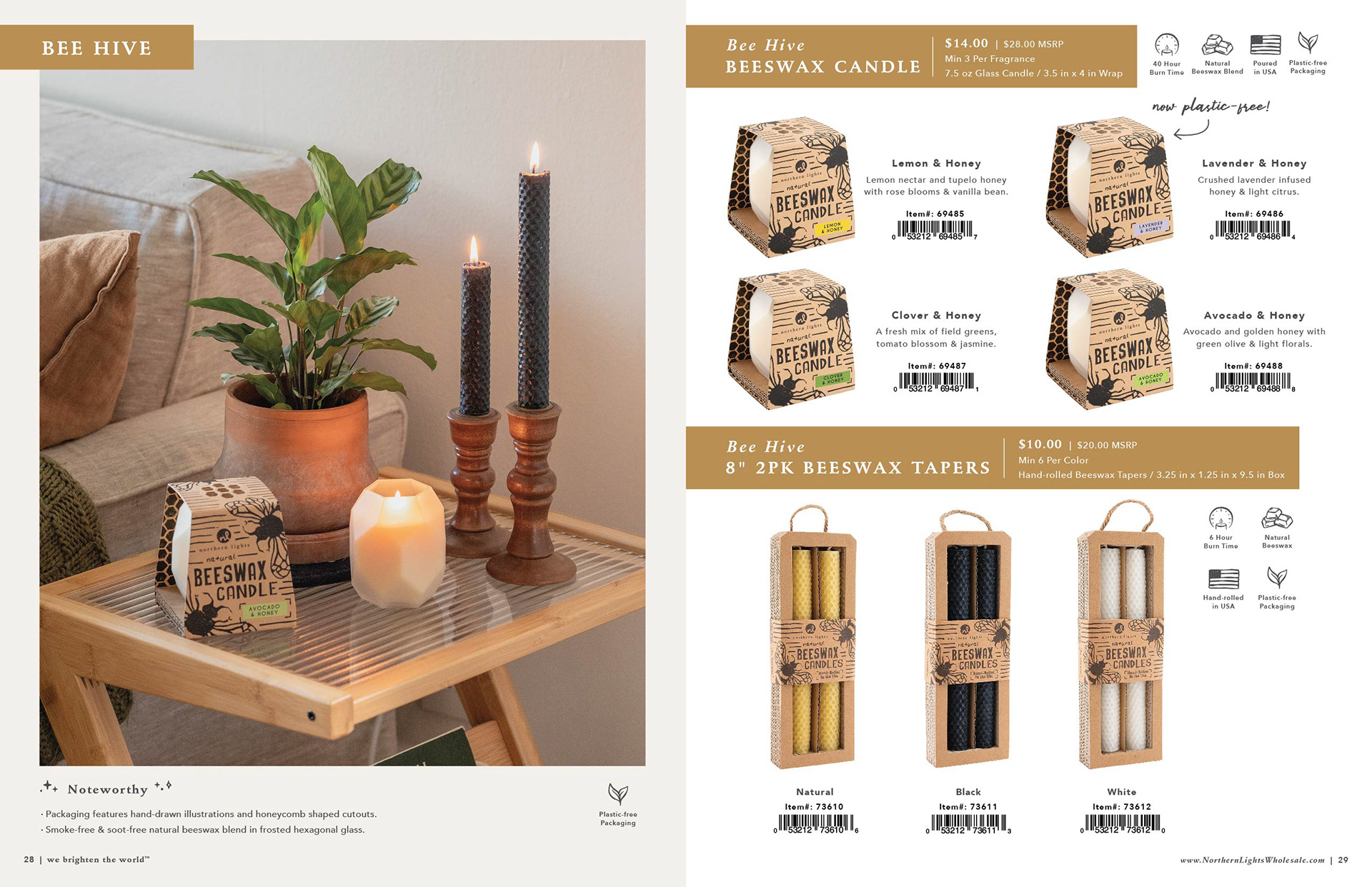
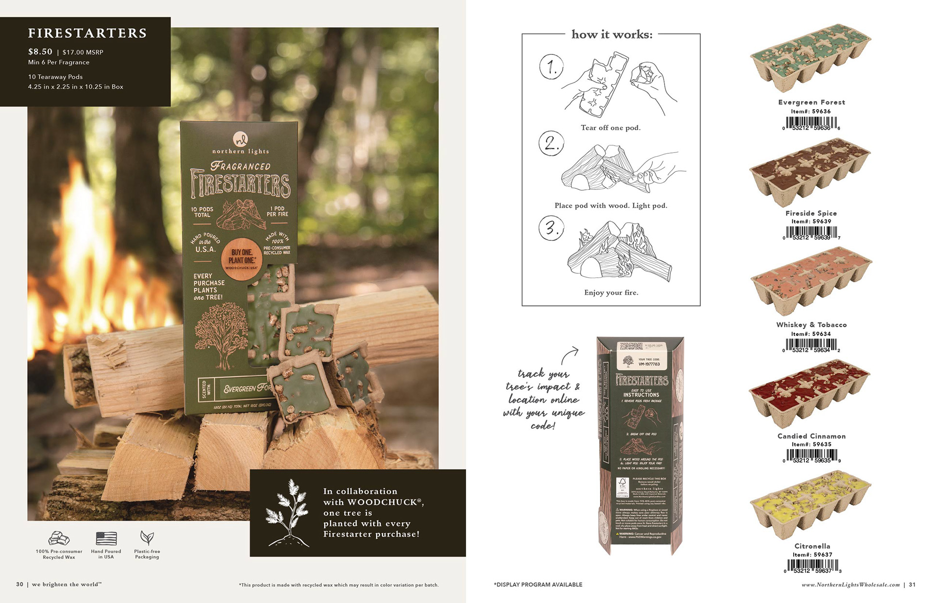
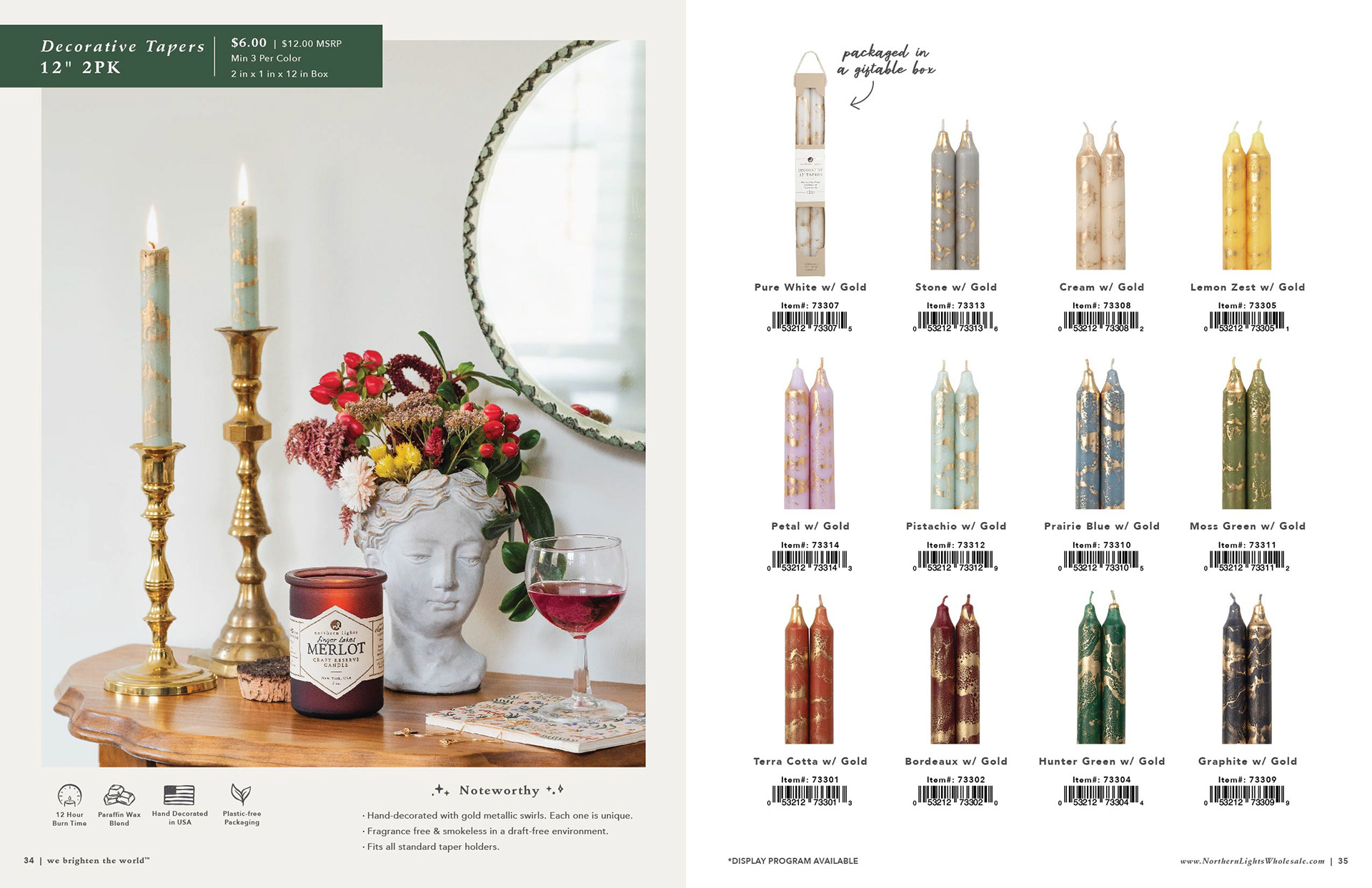
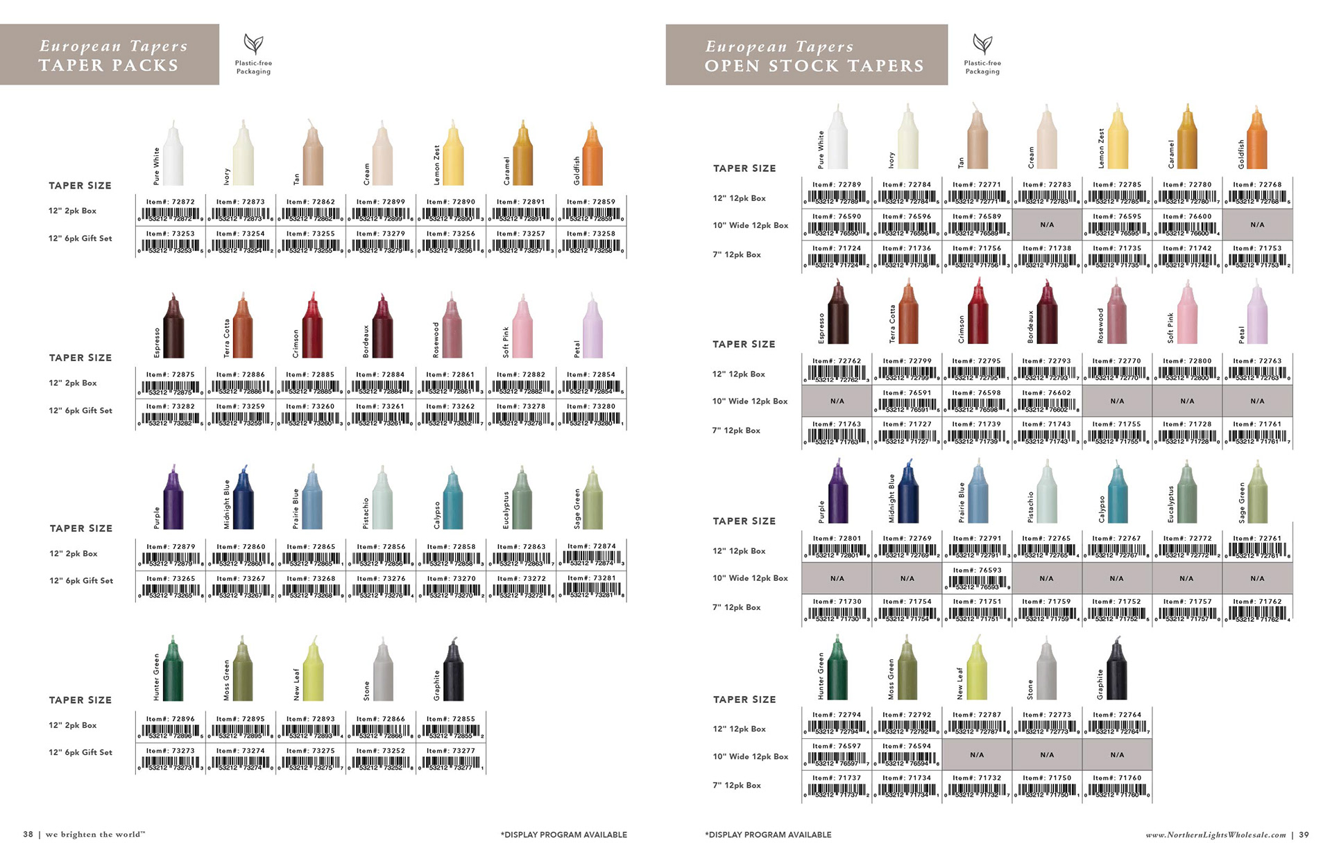
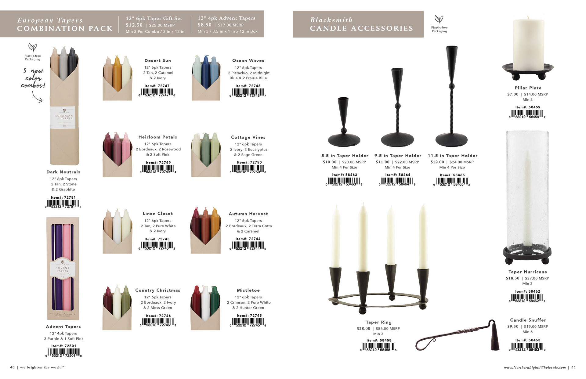
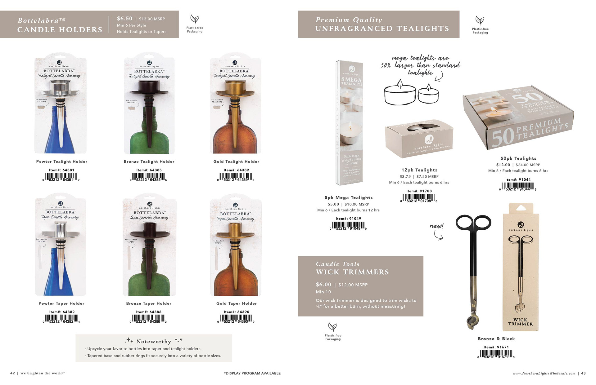
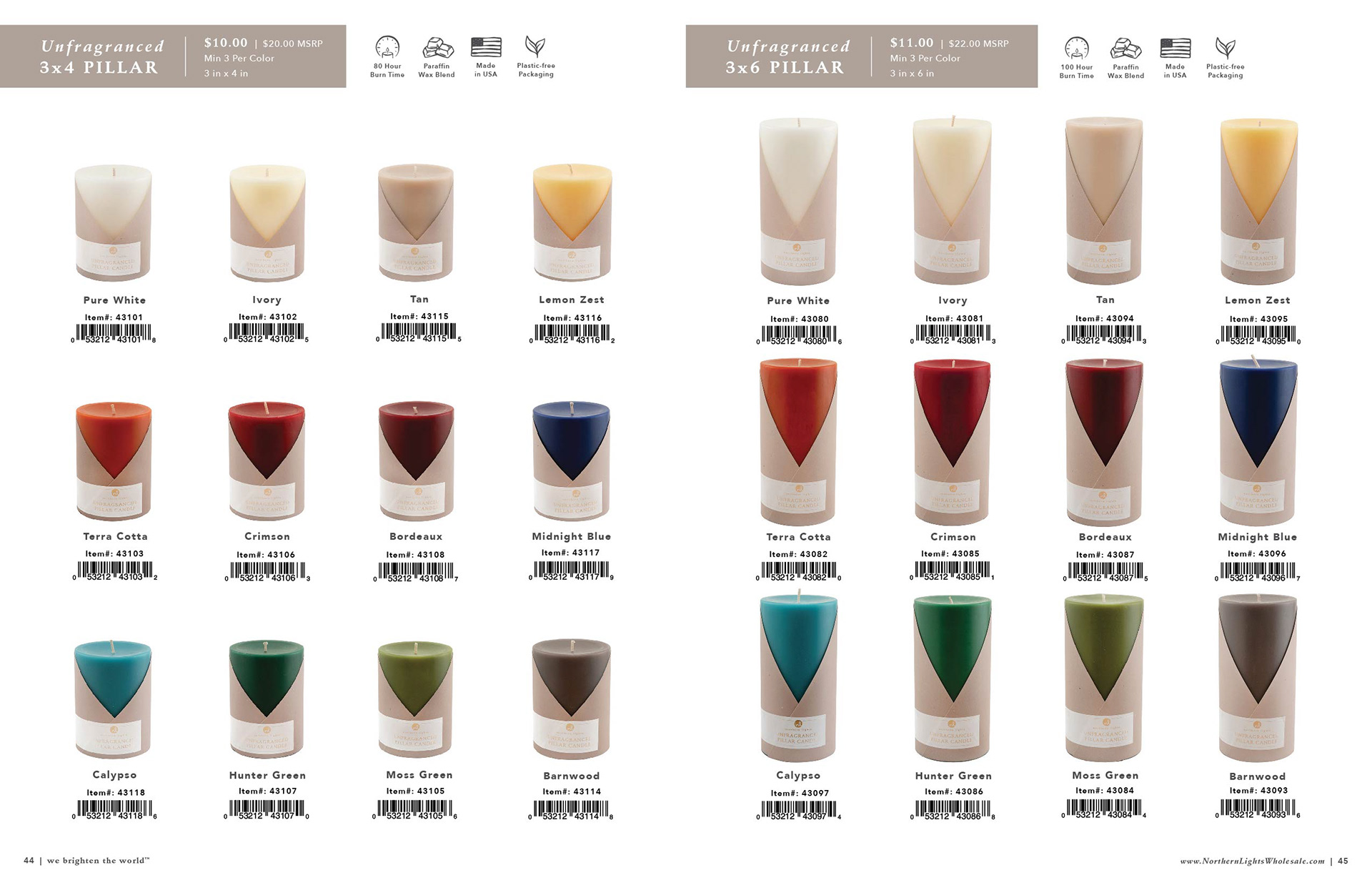
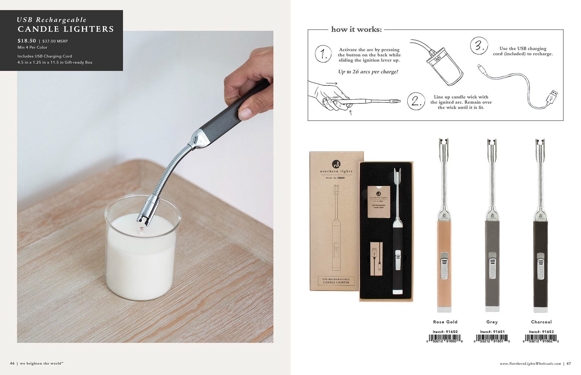
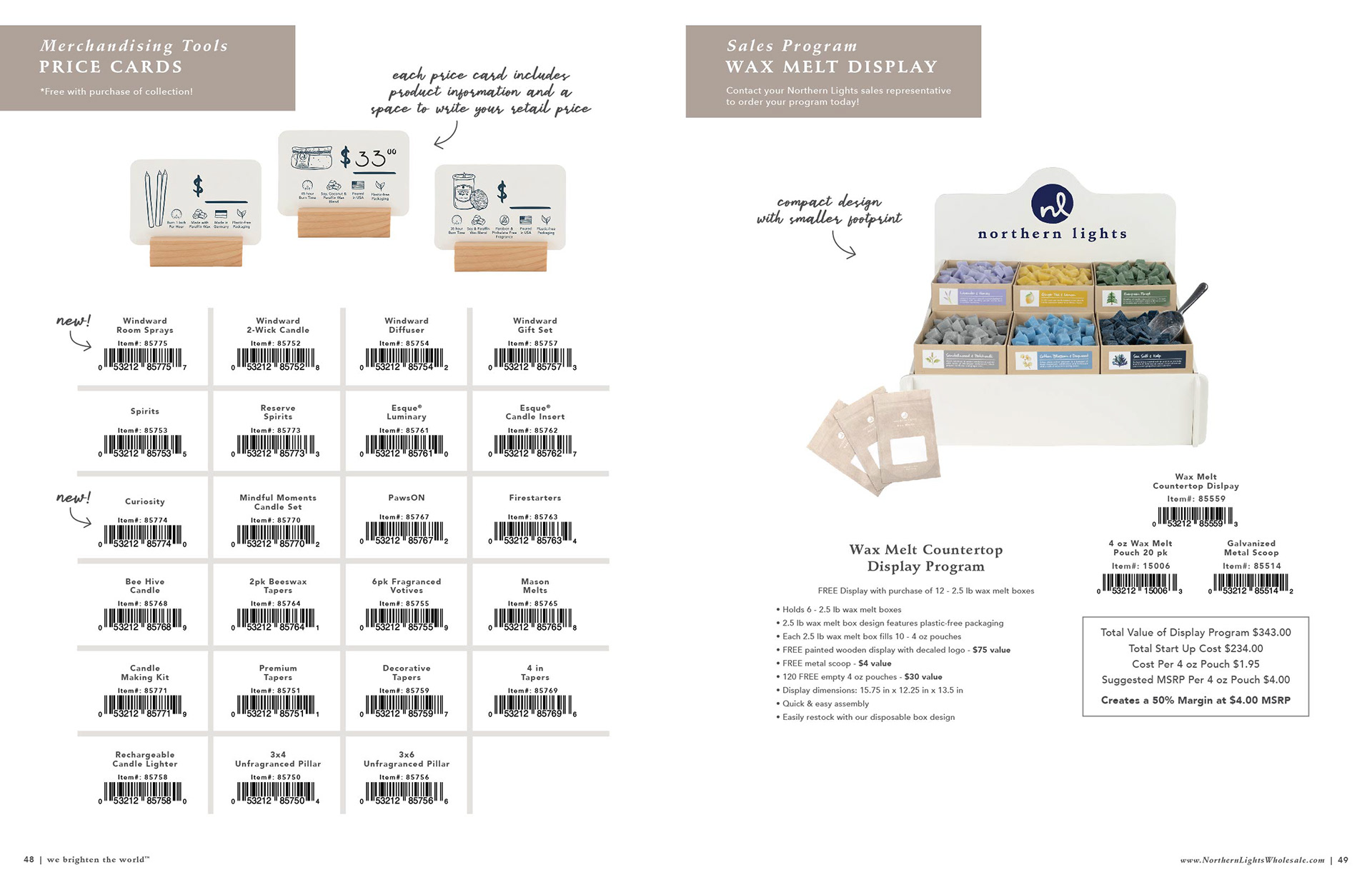
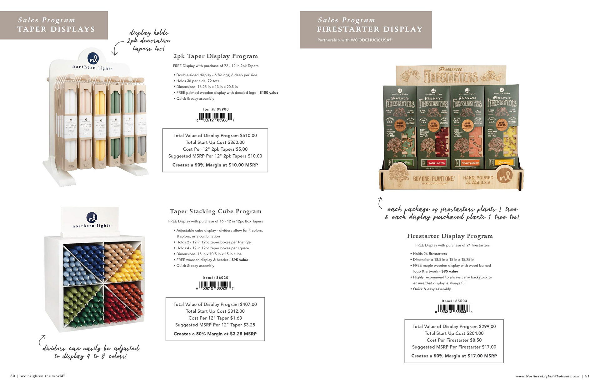
After almost four years photographing for Northern Lights, I can say that almost every clipped product photo shown in the catalog is a photo that I have taken, edited and formatted. These photos receive meticulous attention to detail. I personally choose the best products to shoot to represent the item, choose the best angle to show and edit for color accuracy and ideal product representation (ex. label alignment, wick alignment, etc).
