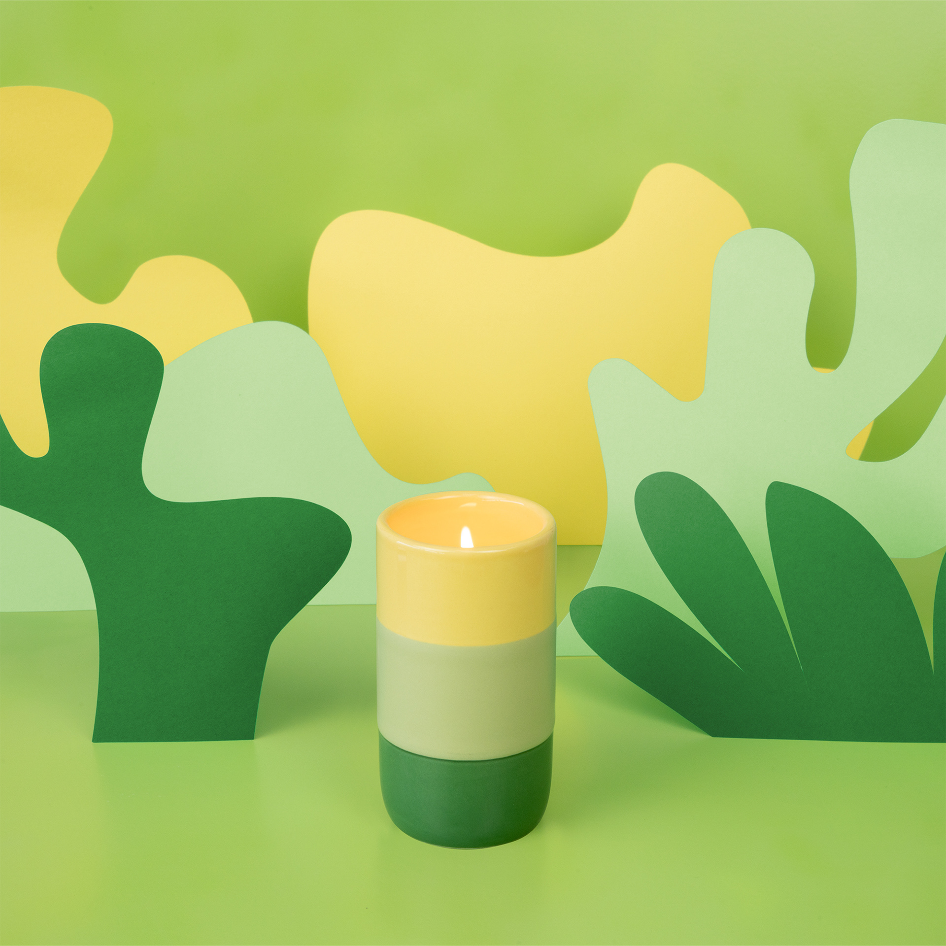
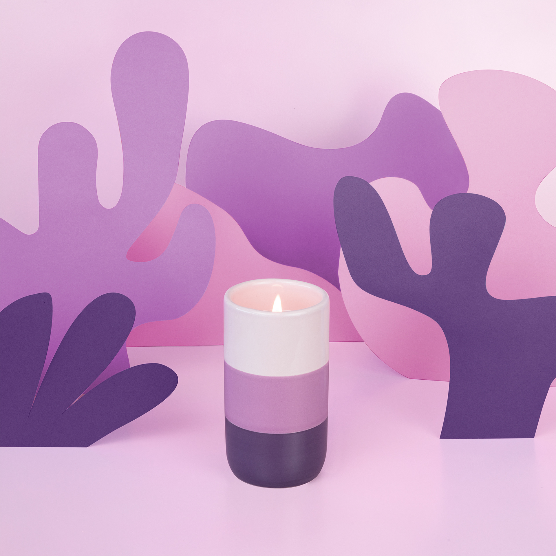
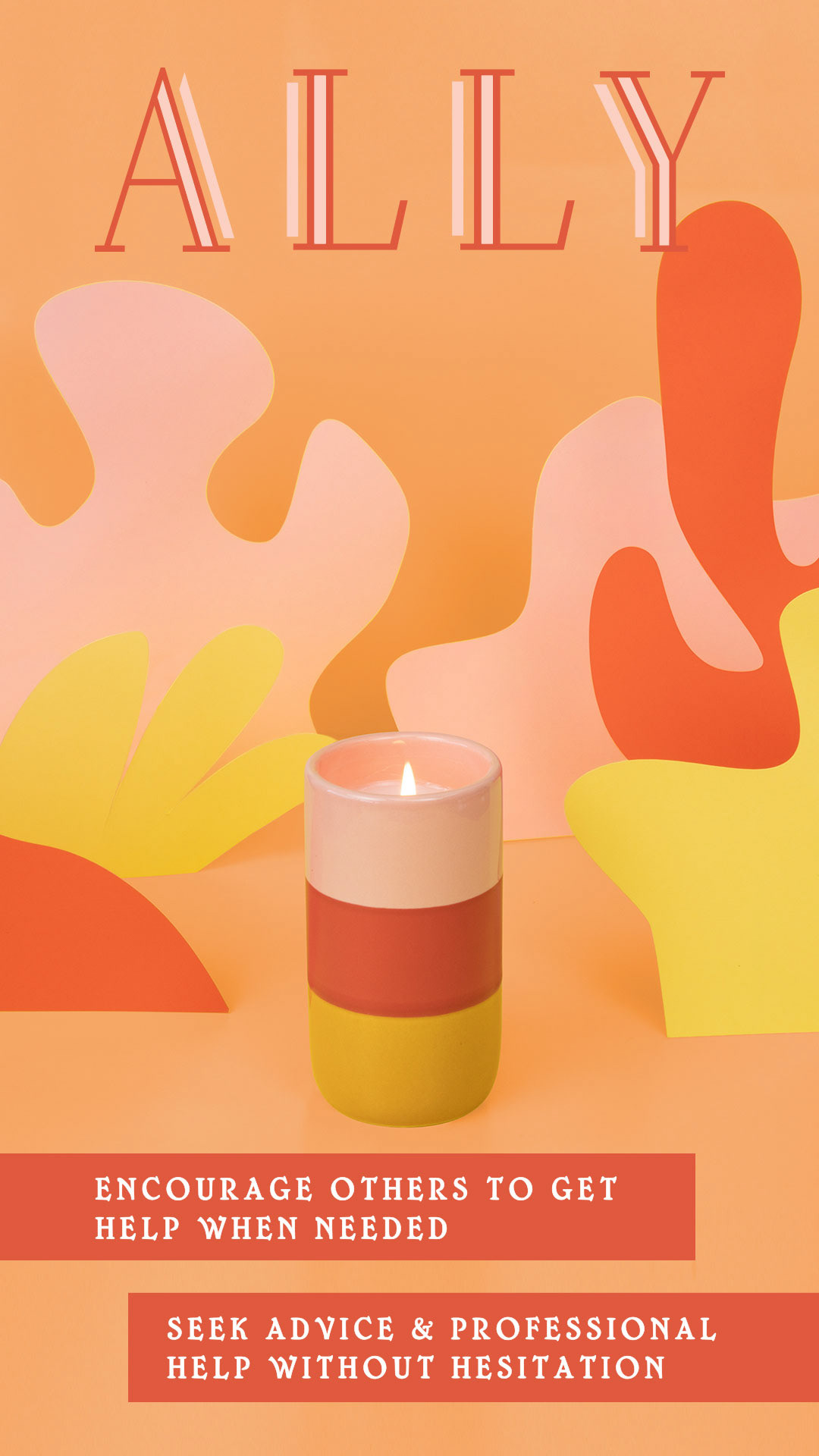
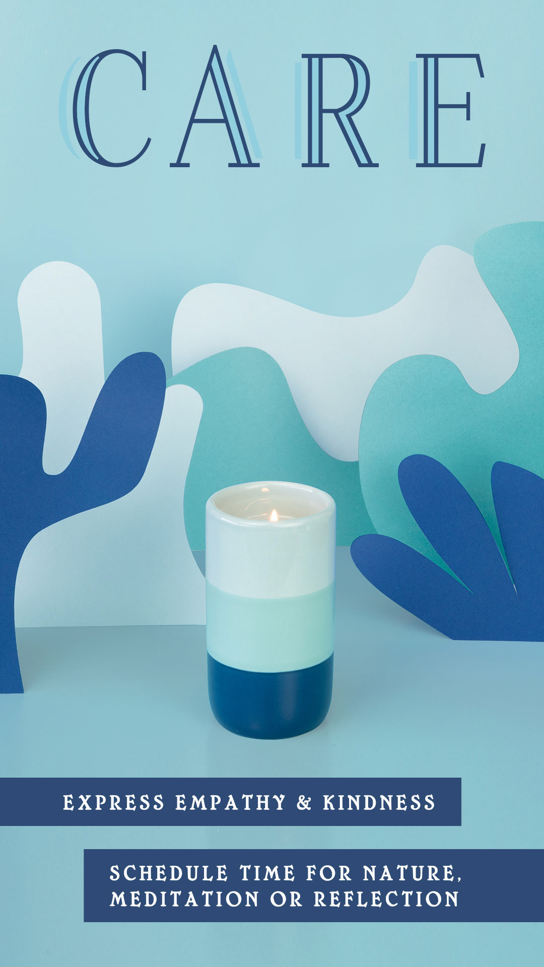
The Process
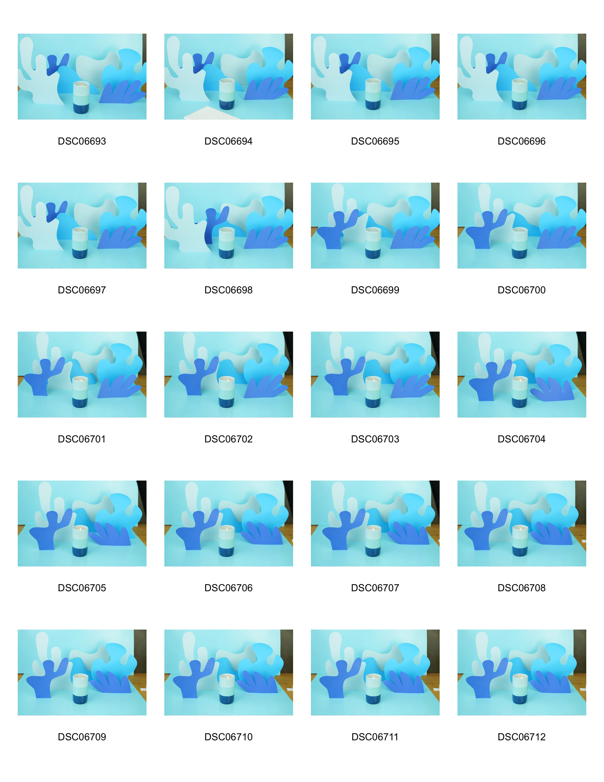
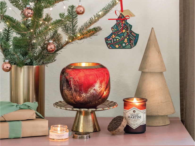
Original idea and first attempt, May 2021. This wasn't looking too good, and we didn't have the studio space set up for this kind of project yet. This concept got put on the back burner.
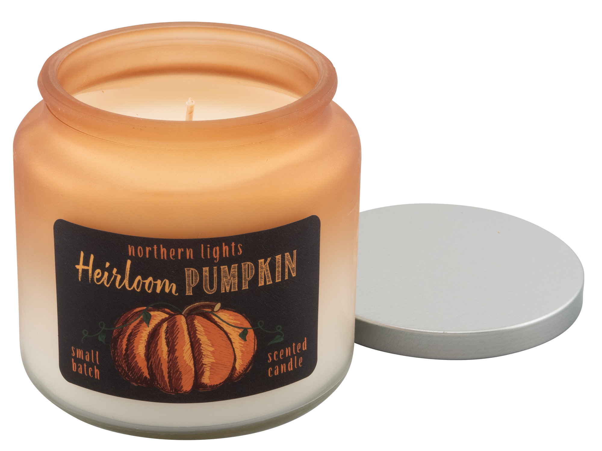
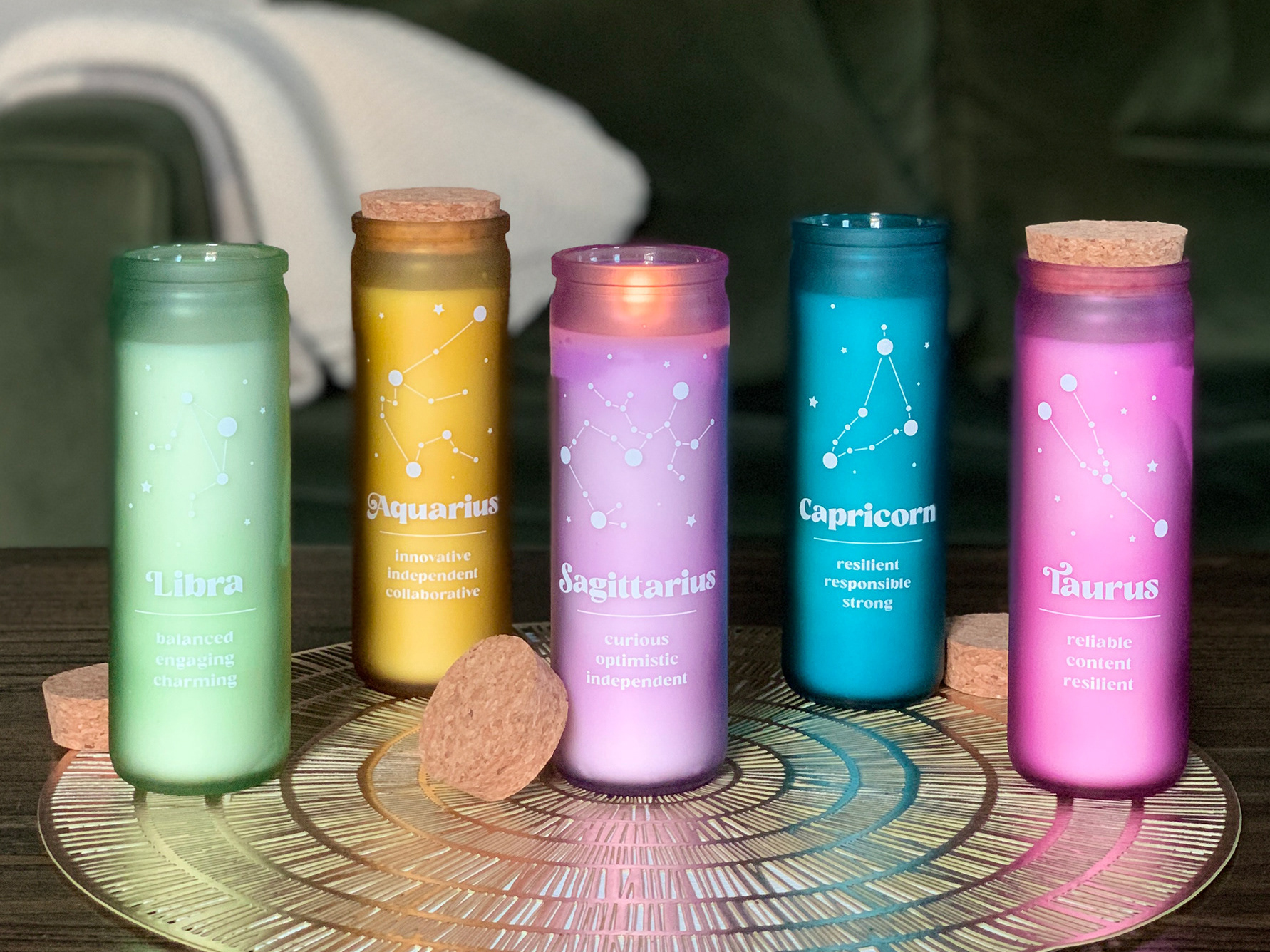
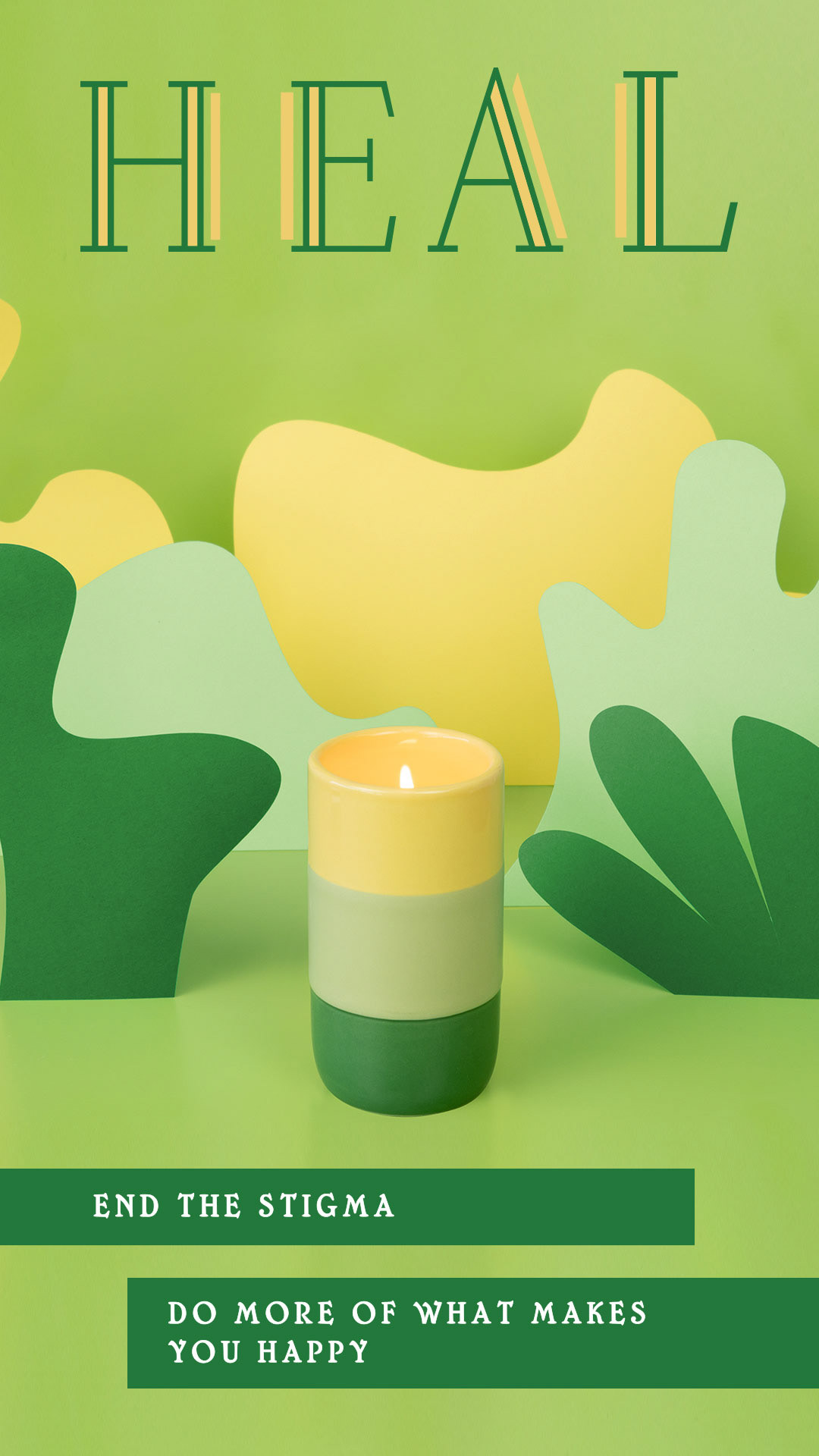
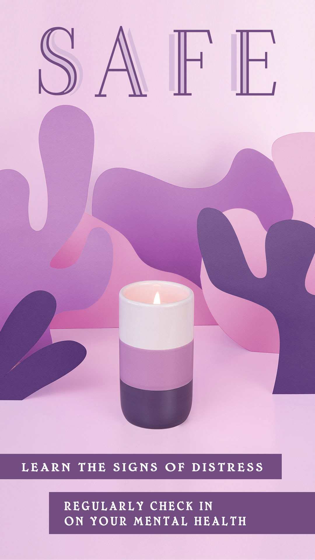
In 2022, the marketing team had the idea of a "Together Takeover" on the Northern Lights Instagram and Facebook. For this campaign, Together candles would be 4 out of the 5 "Fragrance Fridays" during September in observance of Suicide Awareness month.
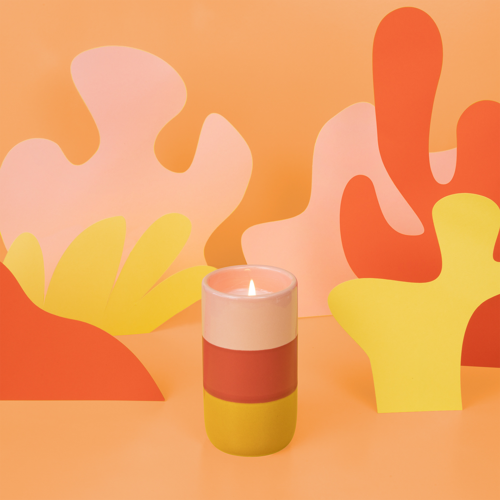
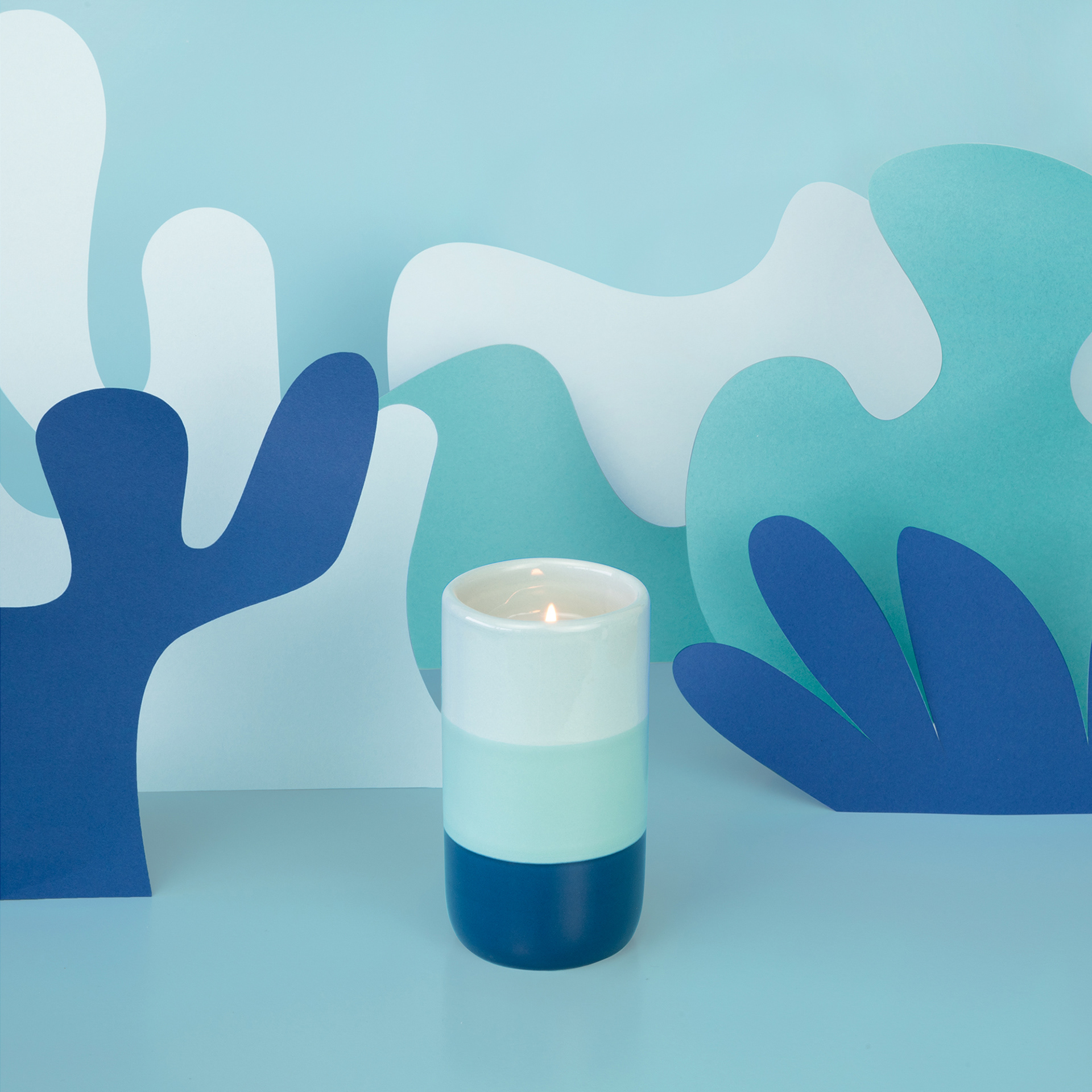
My supervisor wanted to revive the original idea of paper cut outs since that was still trending in product photography and we would need all new photos of the candles in a similar environment for the takeover. The idea was to pull the abstract and whimsical shapes from the packaging and make them into a 3-dimensional prop for the photos, focusing on the color schemes of each candle.
The first time I tried this, in 2021, we did not have a photo studio set up at Northern Lights yet so I didn't have the space or the distance needed for the vision in mind. When I tried to do it back then, I was printing the shapes on my paper and then cutting them out by hand. Now, in 2022, Northern Lights had a new photo studio I could use and my supervisor offered her Cricut to cut the paper. We found an image on Pinterest that was pretty close to our vision:
Photo inspiration from Pinterest
The photo we found was pretty spot on to our vision, so we brainstormed how to achieve the look. I suggested a paper roll for the background, but she pointed out that the horizon line was hidden by the shapes, so we could accomplish the look with two sheets of paper board or foam core.
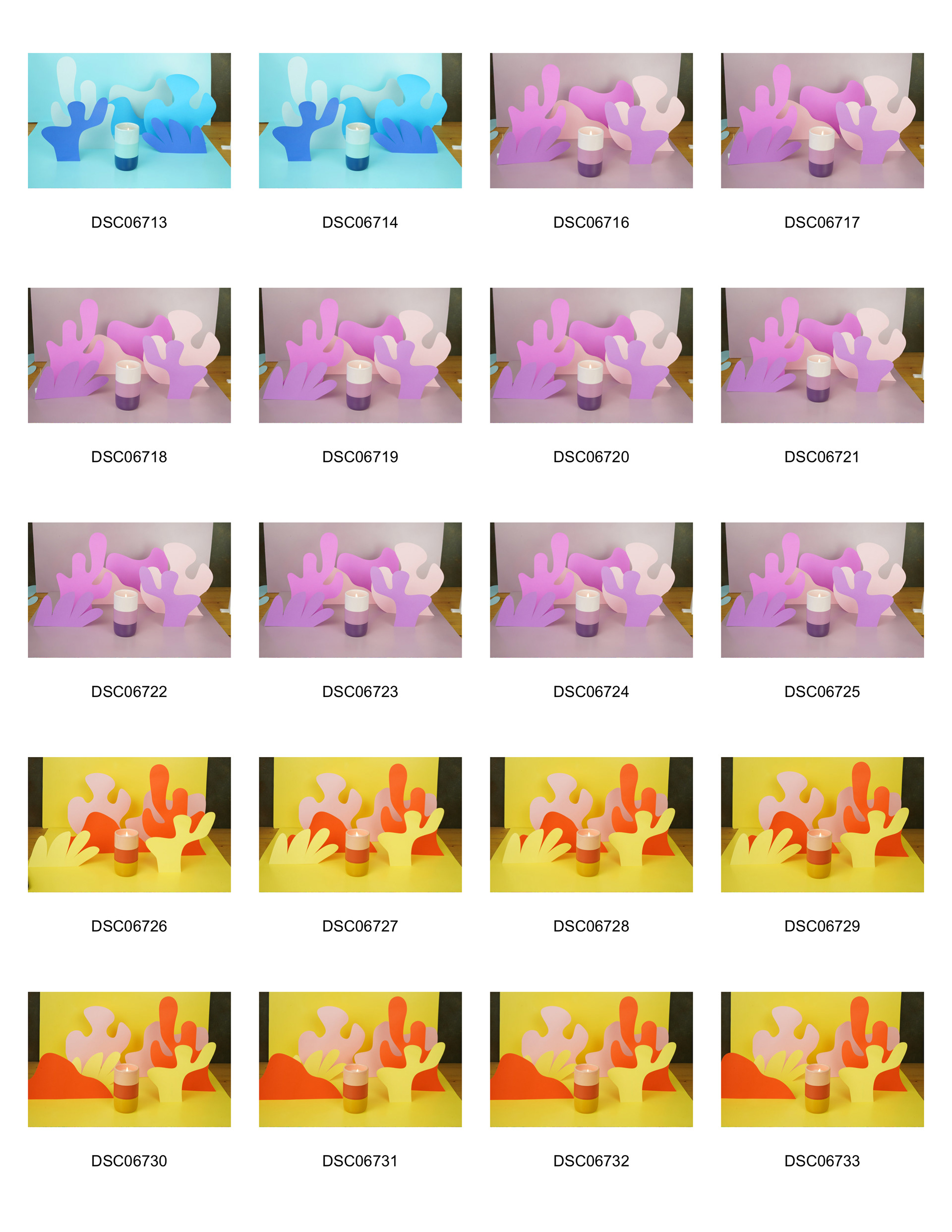
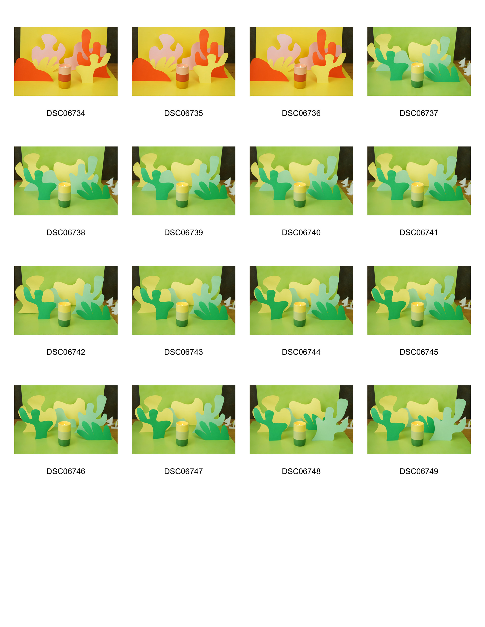
I picked out some spray paint colors and cut down some pieces of foam core for the backgrounds. I sprayed them in the yard behind our office and waited a day to make sure they were dry. I picked out some Astrobright cardstock paper colors and 6 different shapes from the packaging and cut them out on a Cricut. I then started laying them out flat to decide on some basic compositions that would be different enough for each color scheme.

Original composition draft for Safe after cutting out pieces

Original composition draft for Care after cutting out pieces

Original composition draft for Ally after cutting out pieces

Original composition draft for Heal after cutting out pieces
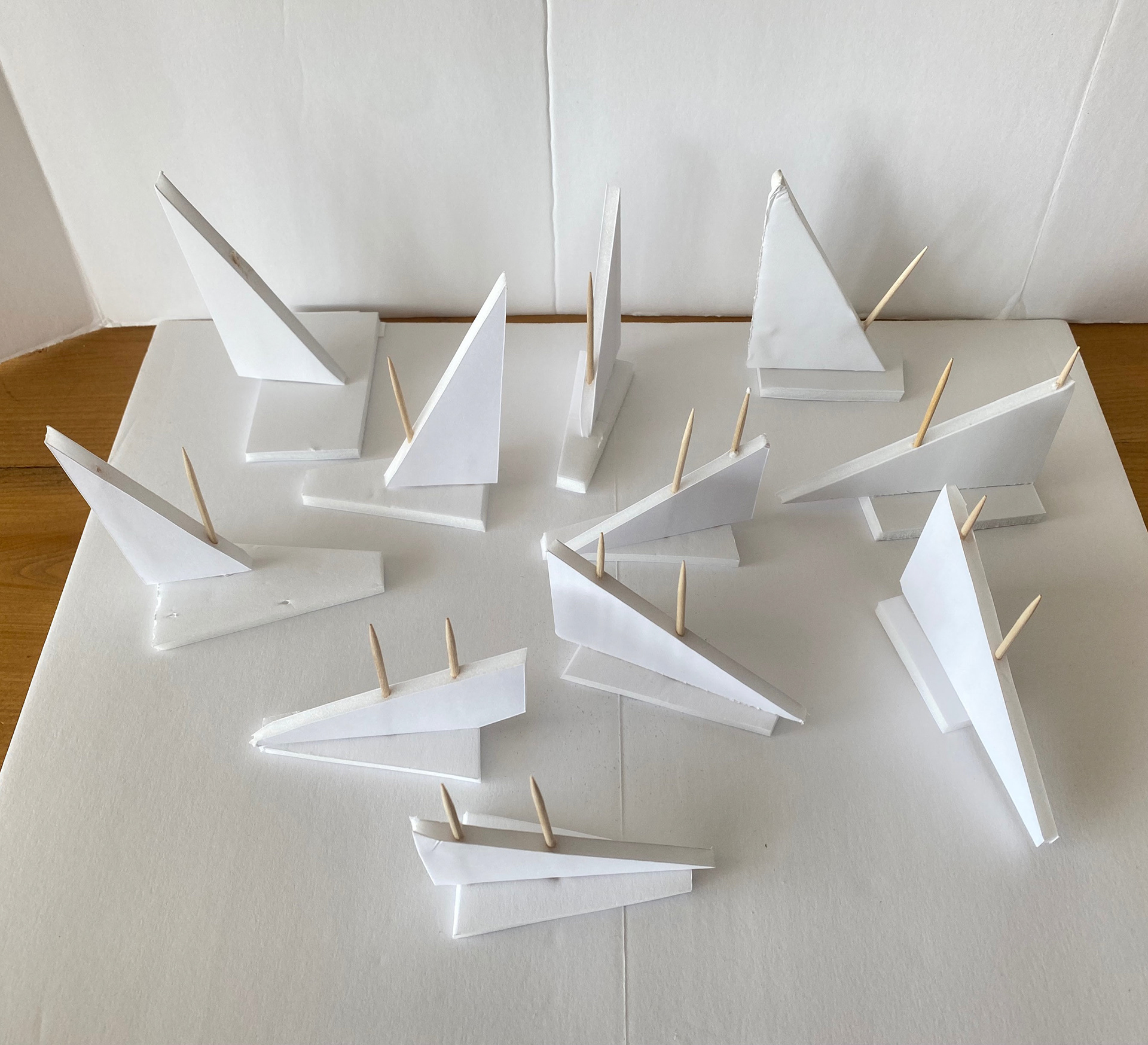
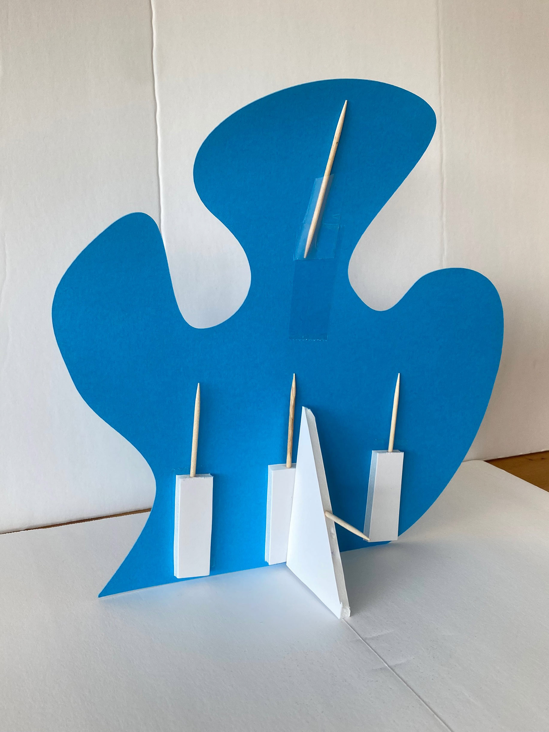
I had a pretty rough idea of how I was going to get these pieces to stand up in the studio, I thought for sure clay and toothpicks would be the answer but I couldn't find any clay. So I made some little support stands out of tooth picks and foam core pieces!
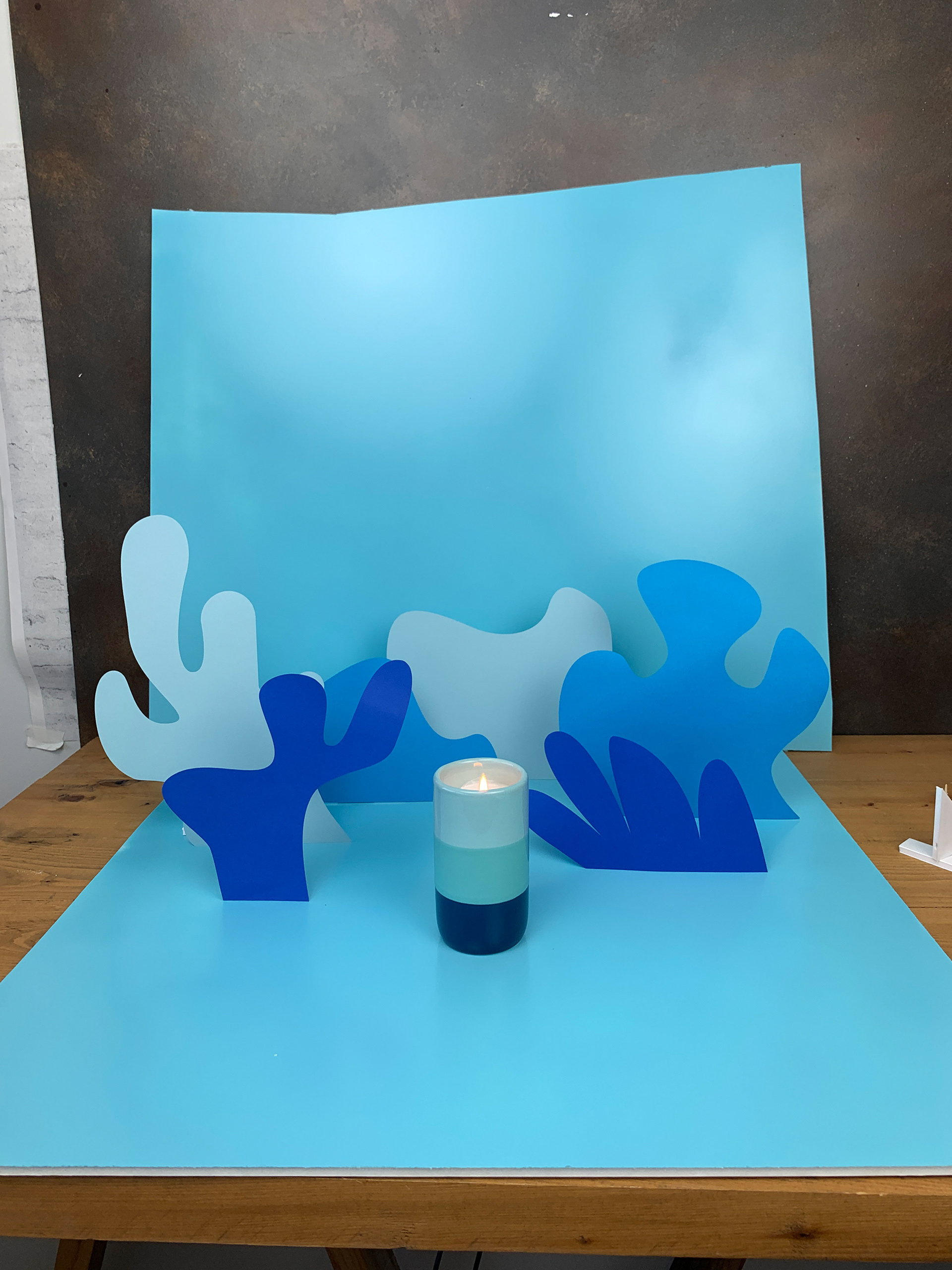
Once they were all photographed, it was time to edit in Photoshop to get the colors a little more aligned with the actual candle colors and hide some of the visually disturbing pockets created by the cut outs..
Original
Final
Original
Final
Original
Final
Original
Final
